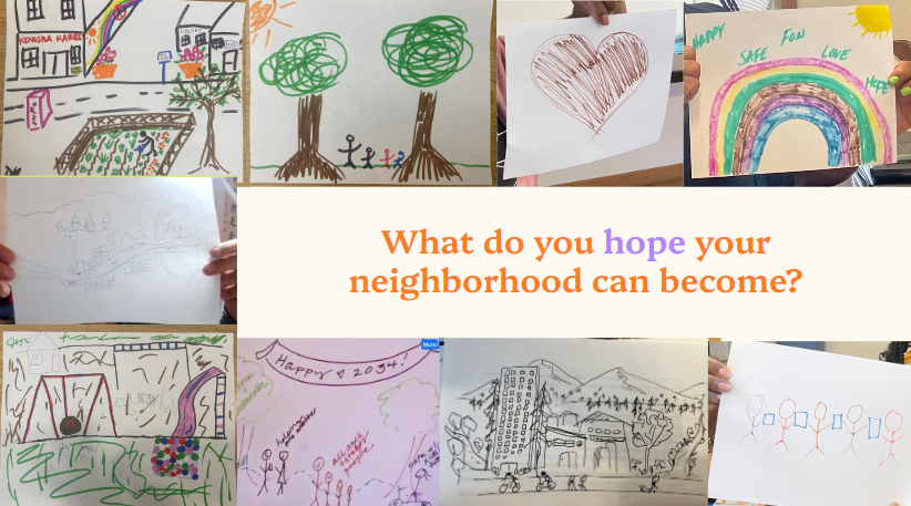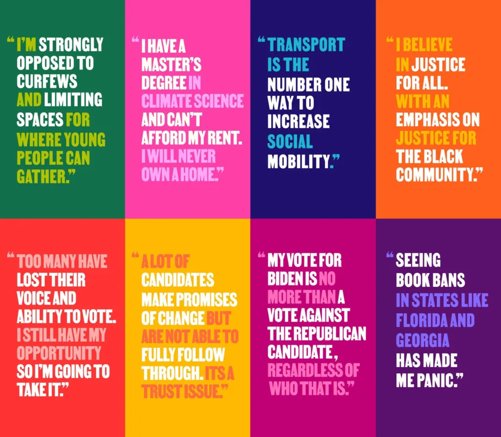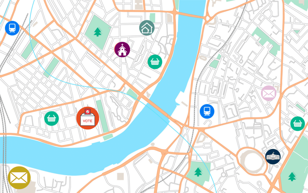
Austin, like pretty much every city in the country, has a problem with voter turnout — especially among young people.
We’ve all heard about this. There have been countless articles, op-eds and panel discussions about how infrequently young people vote, especially in local elections.
But do you know who often leads these conversations? I’ll give you a hint: it’s not young people.
So, a few years ago, our small team at The Austin Common, a news site/civic education organization that specifically serves 18- to 40-year-olds in Austin, decided to do something about it.
We held focus groups and posted online polls with young people in our community and asked them, why don’t you vote in local elections? What are your main barriers?
Some of the responses, like structural barriers to voting, were harder for us to address, but several themes related to media and information kept emerging. Here’s what we heard from young people in our community…
- Just because they had never voted in a local election before, didn’t mean they weren’t interested in the issues (like climate change, criminal justice and affordable housing). They just didn’t understand how those topics connected to what was happening at City Hall.
- If information about an upcoming election wasn’t appearing on their Instagram feed, they were unlikely to be aware of it.
- Many of them were actively avoiding the news on social media.
So we conducted a little experiment… What if we did our election coverage differently? What changes could we make to the way election information is traditionally shared in our city, so that our audience would feel more empowered and informed?
What we landed on was creating a series of shareable election guides, focused entirely on the small, down-ballot races that tend to get the least amount of media attention (think county commissioners and justices of the peace), designed for social media first.
The idea is by no means groundbreaking, but each year, these guides are our most popular and shared content on social media. They’ve also really helped us to grow our audience and develop deeper trust and connection with our readers year round.
Here are some of the lessons we’ve learned and principles we try to keep in mind
The visual design matters
As we discovered in our focus group process, a lot of our target audience avoids the news from time to time (often for mental health reasons). We heard from our audience that reading the news on social media only stresses them out and leaves them feeling overwhelmed and helpless.
So we made sure that our visual design doesn’t look like that of a traditional news site. We chose a style that feels light, welcoming and empowering.

Design for social media first
It’s unfortunate, but we’ve often found it to be true: it’s hard to get people to do more than simply read the headlines. This is particularly the case on social media. Our audience has told us as much. They don’t often click through to read the whole story.
So our goal is to make sure that readers can still walk away with useful information, even if they never leave the Instagram app. Simply posting a picture with a caption describing a voter guide available “via the link in bio” is just not going to cut it.
Challenges: The challenge here is fairly obvious. How do you fit all that information in a short amount of space, without stripping it of all its nuance and complexities, so that it can be published on social media (which is not known for doing any of that well).
We have by no means mastered this, but one way we’ve tried to address it is by breaking things up into a series of posts. For example, in November 2023, Proposition B (a parks bond) was on the ballot here in Austin. If passed, it would fund a long list of projects — too many to thoroughly explain in one post — so we published a series that included one illustrated explainer and two videos.

We still provide links to additional sources of information (like the in-depth podcast episodes we produce to go along with each guide), but at least this way, we offer different options for people, depending on how they like to consume information. And consistently posting these Instagram guides helps to drive traffic to the podcast more effectively than a singular photograph with limited information.
A lesson learned: Designing for social media first also means designing for particular social media platforms. When The Austin Common first began publishing these election guides four years ago, we started with Instagram, because that was the most popular platform for our audience. Today, Instagram is still widely used, but for our youngest readers, TikTok is more popular.
To address this, we simply started reposting our Instagram videos to TikTok, but they weren’t very popular. In doing this, we broke our own rule. To be accessible, information needs to be shared in a way that is fully designed for the end user. Even though TikTok and Instagram both allow you to post videos, the way information is shared on each platform is different and that has to be taken into account. And because our team is so small, we don’t have the capacity to do more than simply repost, so we’re actively trying to raise funds so we can add someone to our team to focus on TikTok exclusively.
In our experience, it’s better to use one social media site effectively than on a bunch with no strategy. Now, we’re trying to strategically expand to more platforms as resources become available.
Focus on explainers
If you haven’t been following it, reading local news can sometimes feel like starting a TV show in Season 3. There’s all these characters and backstories that you don’t know anything about!
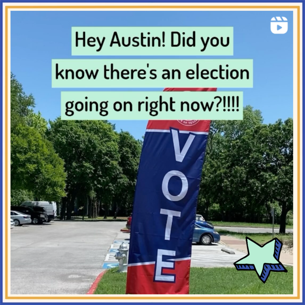 During election season, this confusion is only amplified. Not only are you just tuning in, but you also have to decide which character you like best. That’s a lot of pressure! It’s no wonder many young people decide not to vote at all.
This is why we like to focus not just on the candidates, but also on the background information a voter needs to make better sense of it all.
For example, this year, voters in Austin could, for the first time, elect members of the Travis Central Appraisal District Board Of Directors.
How are you supposed to do that when you don’t even know what the Travis Central Appraisal District is?
That’s why we created this fun video, using a grocery scale to explain how it all works.
The results
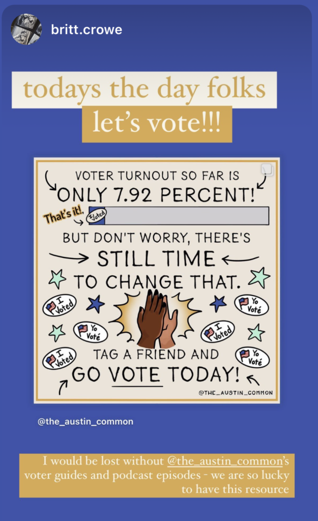 So what has been the result of our little social media election guide experiment? Our very first Instagram election guide series went “viral” (at least by our standards) and we’ve been doing them ever since. Many people in the community have now come to rely on our guides and they message us each election season to make sure we’re doing them again.
And because they get shared so much, these guides have also been a great way for us to pick up new followers on social media, many of whom continue to interact with us year-round, long after the election is over. We try to encourage this even further by posting explainers about who we are and what we do after each election season (to connect with new followers who might have found us somewhat randomly) and by following up with post-election updates.
These kinds of follow-ups, such as this post explaining the priorities of Austin’s newly-elected officials, remind Austinites that their vote matters and continues to have an impact long after Election Day.
At The Austin Common, we like to think of our election coverage as a big invitation to our community to get more involved in our local democracy. It’s the first step on the civic engagement ladder. Now that they’ve taken that first step, it’s easier and less intimidating to read a story about the city’s budget or the new city manager.

This is how we grow and strengthen our democracy: by making it easier for more people to be a part of it.
Feeling inspired and want to bring some of this to your news organization this year? Here are some practical tips:
- Start small. Don’t be intimidated by the idea of focus groups and surveys — these can be done fairly easily and inexpensively. Our first focus group lasted 1.5 hours and included 15 people (whom we compensated with a free dinner).
- Make sure you have the right people leading this project. It’s hard to connect with young people if you have no young people on your staff. Initiatives like this work best when they’re led by the people they’re meant to serve.
- Collaborate. We’re a super small organization. To make sure our election guides reach a broader audience, we share them with other organizations that connect with young people, like universities, young professional organizations and social clubs. A few years ago, we even partnered with a local arts group to turn our guides into murals.
Amy Stansbury is the Editor-In-Chief of The Austin Common, a local news site and civic education organization that actually explains the news and uses art and social media to make learning about local government accessible… and even a little bit fun!
Share with your network
4 ideas on election engagement that can lead to longer-term relationships
You also might be interested in:
We have an opportunity to facilitate civic discourse within our communities in a way that’s mutually beneficial. But if we don’t do this work thoughtfully — if we show up with a rigid agenda and our own goals — it can cause more harm than good.
When local newsrooms give people the tools and platforms for creative storytelling, they’re also building trust and supporting the creative and cultural health of their communities. Here's how for news leaders did just that.
We asked five leaders with community engagement experience outside of news about the opportunities they see for local media to build trust or belonging, from using physical spaces like libraries and community gardens to digital platforms that support shared experiences.
