News media can thank Silicon Valley for the collaboration mindset that imbues newsroom redesigns. Modern workplaces celebrate problem-solving teamwork, from the adoption of open floor plans to the use of open-source software.
But when it comes to inspiring more collaboration, architects remind us there can be too much of a good thing.
One of the challenges for companies as they seek to encourage collaboration is how to balance “me” vs. “we” space in the workplace, said Tom Price, principal architect at Strada Architecture in Pittsburgh. His firm has created innovation spaces for a variety of companies, including Google’s Pittsburgh office. Although increasing collaboration has become a ubiquitous goal among forward-thinking companies, he said companies have to be careful not to be overly invasive in encouraging it.
If a renovated workspace is dominated by too much common space, employees often feel like there’s too much “us time”, when “people get together either physically or virtually to brainstorm, but never seem to arrive at anything original or refreshing,” Price said. Oppressive “us time” sessions, he said, leave people “disinterested, less connected, and wondering if they actually contributed anything of value to the event.”
While different organizations use a variety of design solutions to encourage collaboration, the emphasis on increased collaboration reflects a new way of working for all — the shift from a linear mode of production for legacy platforms to a more dynamic, digital one. As Price acknowledged, this doesn’t exclude solo work; it embraces new ways of interacting in the workspace.
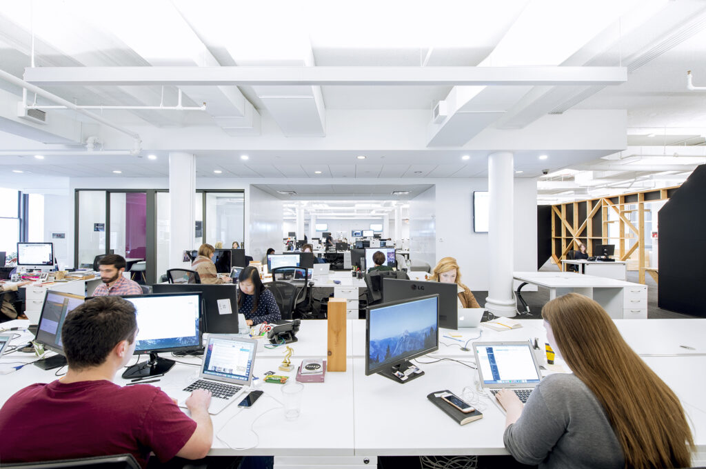
Quartz’s newsroom is streamlined and open. At the periphery are alternative, creative spaces where small groups can meet or individuals can shift for a change of scenery. (Photo by Mark Craemer)
Three types of spaces that balance ‘me’ and ‘we’ time
Companies should create workspaces that support a diverse range of working styles throughout the day, Price said. While he emphasized there is no one-size-fits-all floorplan, he suggested three types of areas within workspaces that naturally increase collaboration, balance “we” vs. “me” time, and support innovation:
Collision — These are strategically located communal spaces where people can get food and drinks and socialize when they run into one another. “These types of spaces help people navigate their day by allowing them to relax, recharge, and connect when convenient to their schedule,” Price said. “These creative gathering places should also create an experience that is distinct from the rest of the workplace.”
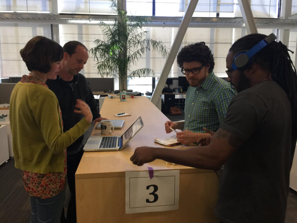
At the Center for Investigative Reporting, a casual, open area with a high table enables quick conferences on work in progress. (Photo by Rachel de Leon)
Mixed-use — Mixed-use, mixed-scale, and mixed-personality rooms and furniture clusters allow users to approach their work creatively. Spaces with their own personality, such as workshop-like “maker” spaces or home-style living rooms, “inspire nontraditional modes of meeting, sharing, breaking and testing,” Price said. “These flexible spaces also empower users to modify the space to meet their immediate needs.”
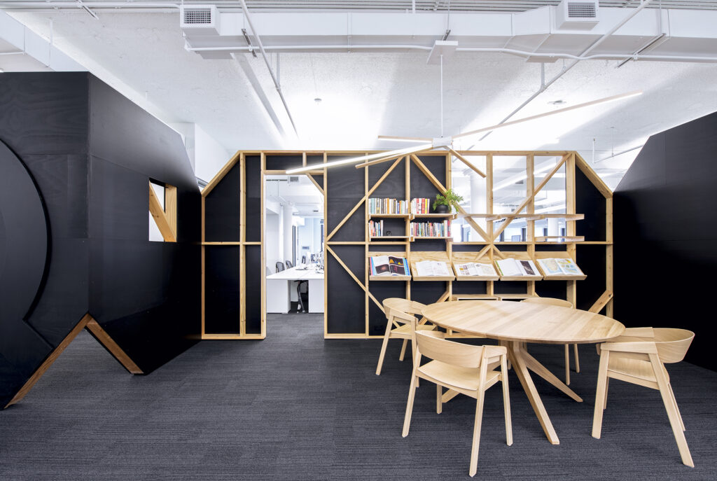
In addition to providing alternative spaces for solo and collaborative work at Quartz, these breakaway spaces set off from the open newsroom honor staff passions. The Library, shown here, celebrates their love of books and print. This analog room also exemplifies Quartz’s “lo-fi” approach to design, with a simple, neutral palette and natural materials. (Photo by Mark Craemer)
Huddle — Although collision spaces are typically the largest drivers of collaboration culture, “they rarely provide the distraction-free focus space critical for thinking through problems and innovating,” Price said. Small huddle spaces with a mix of screens, whiteboards and flexible seating options not only support small-group brainstorming sessions, but also easily adapt to solo “me time” types of work.
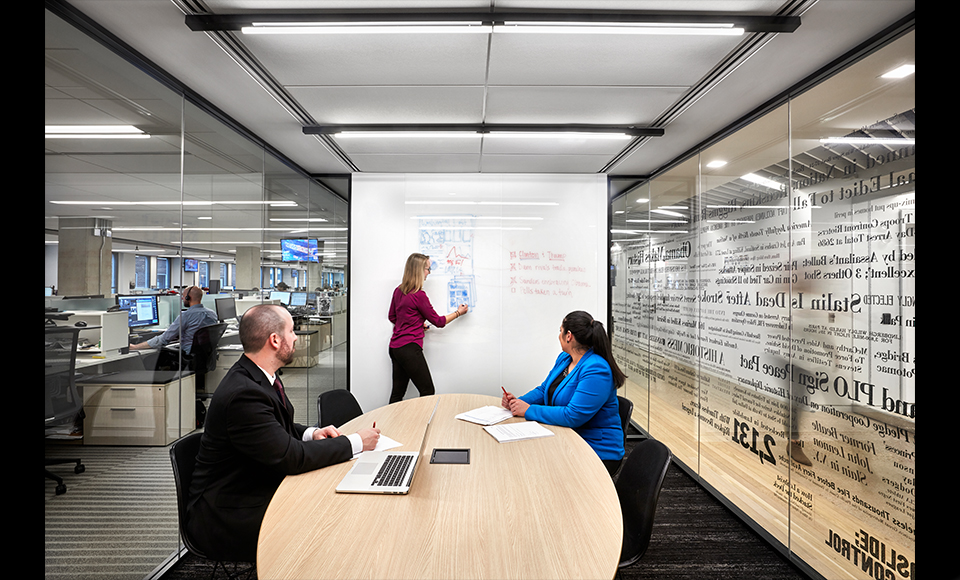
Compact meeting rooms, such as this “huddle” space at The Washington Post, provide a place for brainstorming, small group meetings or solo work in an environment that is less formal than a conference room. (Photo by Garrett Rowland)
Make design decisions that reflect your priorities and values
Creating a more collaborative newsroom is less about tearing down walls and more about tearing down silos, said Tracy Grant of The Washington Post. In considering how to design the Post’s new home in 2015, leaders decided the new building had to make it easier to collaborate.
The practices of a modern, digital newsroom “require face-to-face conversation,” Grant said. “You have to make it easy for that to happen.” If employees have to walk up a floor to talk to someone, they’re less likely to collaborate — “unless you’re a Fitbit wearer.”
She worked to ensure coworkers on the same team would be in “chair-rolling” distance, or at the most, around the corner from one another.
Grant said she pondered ideas for new floor plans for more than a year. “At first I thought, ‘I’m just going to be wild and crazy and mix everything up,’ but then I realized that having national security pods sit next to foreign relations staff made sense.”
“In some ways, the configuration isn’t hugely different,” Grant said, but now the Post has teams they didn’t have. “The social media team has proximity to the hub,” the central editing area, “so if there’s breaking news, there’s a lot of easy communication and collaboration around that.”
Sumita Arora, a principal at the architectural firm Gensler, said creating strategic “adjacencies” in the workplace is a way to express an organization’s priorities. Arora leads Gensler’s “Media Practice Area,” which specializes in architecture, workplace strategy and design for media companies around the world. Its past clients include the Post and The Dallas Morning News.
The Post, Grant said, has had “enormous success with embedding engineers in sections, and making sure that graphic, photo, video and product teams are sitting closely to each other so conversations can happen organically.”
Brian Boyer of Spirited Media said “the principle that leads all of this is about increasing communication – about creating a team that talks to each other.” Boyer is vice president of product and people at the company, which runs Billy Penn in Philadelphia, The Incline in Pittsburgh and Denverite.
When Boyer headed the Visuals team at NPR, he led a grassroots efforts to transform his team’s workspace — and its culture.
Change number one was initiation of a daily “scrum,” which is part of the “agile” software development ethos he practiced at the Chicago Tribune. Boyer required his team to be on site by 10 a.m. every day for the scrum — essentially a fast-paced briefing where the team stands in a circle for the duration of the meeting.
What’s key is that the scrum was held not in a conference room, but in the center of NPR’s newsroom. That showed the rest of the staff that Boyer’s team was committed to open communication.
When you make things visible, Boyer said, you prioritize them. “There shouldn’t be any secret projects,” he said. “Everyone should know what everyone is doing.”
But that doesn’t mean you need an expensive remodeling effort. “Ours is essentially a craft project,” he said of his teams’ spaces at NPR and Spirited Media.
They have used whiteboards, markers and sticky notes, or a cork board with yarn and index cards, to map out projects for everyone to see. He refers to these visible indexes in team areas as “information radiators” that are like television screens flashing at a convenience store checkout: “You don’t have to look, but you happen to look.”
“If you have it in the space, it is physical. Instead of having a plan in a manager’s head, the plan is on the wall,” Boyer said. This creates accountability, but it also fosters empathy and an understanding of everyone’s role on the team.
What does your seating layout say about your leadership structure?
Open workspaces with creative furnishings may seem like little more than an aesthetic nod to trendy tech culture. But they’re physical manifestations of another trend: the flat organizational charts that characterize many of the world’s most innovative companies.
Research by MIT Sloan Management Review suggests flatter hierarchies are essential for obtaining true digital expertise and instilling innovation and risk-taking among employees.
According to this research, companies that are early in the process of transitioning to digital workflows are characterized by “a low appetite for risk, a hierarchical leadership structure, and work performed in silos.” Organizations that have embraced a digital future, on the other hand, have flatter leadership structures, value experimentation, and foster collaboration. This model of distributed leadership is prevalent in the technology industry, the primary influencer of the news business.
Even furniture can signal a more egalitarian culture. In the Post’s newsroom, each desk has a file cabinet with a cushion on top, which can be pulled out to sit on like an ottoman. “Now, instead of hovering over your shoulder, an editor is sitting shoulder-to-shoulder with you,” Grant said. “It’s symbolic and practical.”
Similarly, Boyer cautioned, if you’re designing for collaboration, never use L-shaped desks.
“An L-shaped desk means someone is in the back seat,” he said Boyer. “If it’s a straight desk, you are peers.”
Open-ended spaces inspire innovation
When the online news outlet Quartz relocated to accommodate its growing team, Senior Vice President of Product and Executive Editor Zach Seward wanted to create more opportunities for staff to collaborate away from their desks. Quartz kept its open floor plan where everyone sits together with the same-sized desks, but it combined that with mixed-use areas where employees can move from space to space.
“Obviously we needed desks and conference rooms, but we wanted to allow for other spaces” to encourage different ways of interacting, Seward said. “We call them Quartzy spaces.”
The new location has several casual, creative spaces where people can work and socialize, such as the Town Hall, the Library and the Workshop. Seward said they were meant to spur meetings and gatherings. But he also noticed an increase in informal solo work away from desks, which meant people were sitting next to coworkers they might not have otherwise encountered.
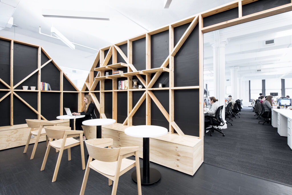
One of the structures adjacent to Quartz’s open office area is a café-style nook, designed as a change-of-pace work area. It’s suitable for working alone or in a small group. (Photo by Mark Craemer)
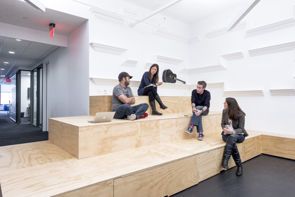
A corner of the “Town Hall” features a stage-like structure with storage below. This corner begs to be climbed — as much a play structure as a platform — and encourages creative ways of working. The rest of the Town Hall is used for whole-staff meetings, to eat lunch, and to host events. (Photo by Mark Craemer)
Adam Alter, in ”How to Build a Collaborative Office Space Like Pixar and Google,” writes that these kinds of purpose-free spaces “encourage workers to do their thinking in the presence of other people, rather than alone.”
These are precisely the behavioral transformations that architects aim for when they design communal spaces. In addition to enabling impromptu interactions that can change the dynamic between workers, they serve as a kind of blank slate, a subtle invitation to create something new and different. In other words, to innovate.
Grant said she was initially skeptical that this kind of informal gathering space would promote behavioral change. But in the new Washington Post newsroom, she said she often sees people migrate to a relaxed area dubbed the ”airport lounge” for a change of scenery during the day or to hand off work between shifts.
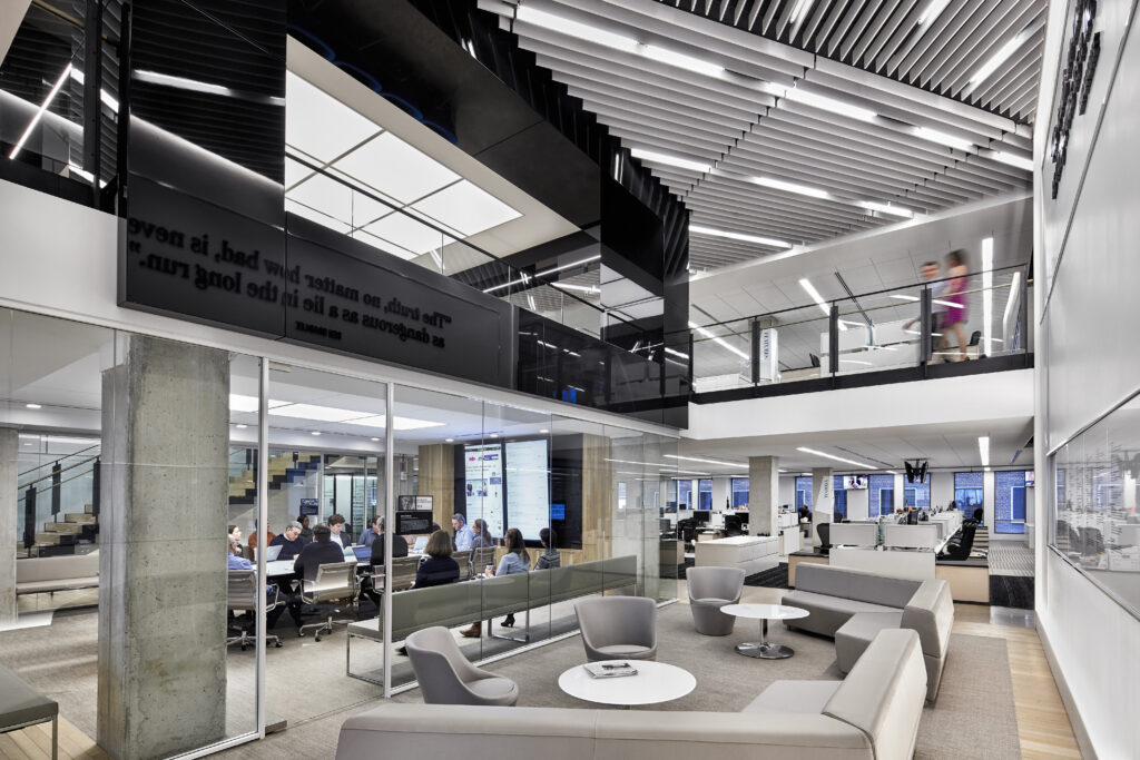
At The Washington Post, this casual seating area situated outside a conference room near the central editing hub has been dubbed the “airport lounge.” People use it to chat while waiting for a meeting, to continue conversations as they exit story conferences and to hand off work between shifts. (Photo by Garrett Rowland)
Newsrooms don’t need an expensive architect to transform a corner of the newsroom into an effective communal space. Jones at The Virginian-Pilot refreshed a drab lobby into something special with DIY flair, finding creative ways to save money.
“This was a very antiquated, typical lobby with plaques and trophies,” Jones said. “We needed to make people feel like there was an area they could veg out, take a call, or have fun.” So they took over the entire lobby, removed the dusty awards, added two 15-foot-long butcher block tables with bar stools, and turned a nearby closet into a coffee bar.
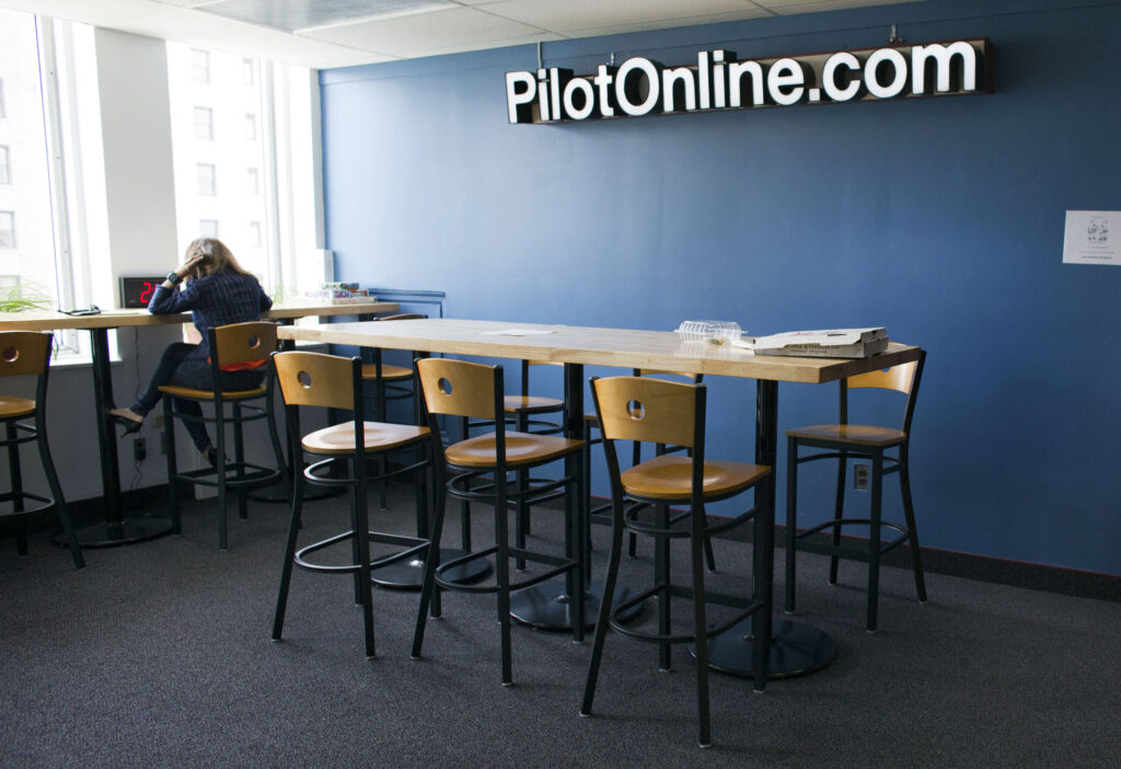
Before the Virginian-Pilot’s renovation, this was a dark lobby with a trophy case. Now it’s an open-ended space with natural light — a new place to work outside the newsroom. Plans for this space include installing a large-screen television. (Photo by The’ N. pham)
This multi-purpose lounge serves as a breakaway workspace, a place to take a coffee break and a place to socialize. “Everyone volunteered to bring in games,” she said. And while it isn’t quite Google, legendary for its free food, Jones said, “We put out candy, pretzels and peanuts every day, and we have lots of pizza lunches.”
Where’s my office?
More than one editor interviewed for this study said that at some point during the renovation, an anxious employee sent them a column called “Google got it wrong. The open-office trend is destroying the workplace.” In it, Lindsey Kaufman discusses the trauma of moving from an office at her Tribeca ad agency to a seat at an open table. She likened it to having her clothes ripped off in public.
A response to that piece, “Google Didn’t Get it Wrong,” counters that Kaufman missed the point by focusing on the lack of privacy in an open workplace. Kay Sargent asserts that when the execution of an open office plan aligns with a company’s goals and culture, employees collaborate and innovate more. As architect Tom Price noted in his caution to balance “me” and “we” spaces, it’s important to create flexible layouts with different kinds of spaces.
In their research on emerging work styles, architects at Gensler asked if individual work can survive in the collaborative workspace. That’s certainly an issue in newsrooms. Sometimes a videographer needs a quiet place to work through a difficult edit. Some interviews are too sensitive to conduct on the phone in front of coworkers. Other times, an editor wants to be able to turn to someone for help on a headline.
Gensler looked at the balance between focused and collaborative work options among software developers in a major technology company. An important takeaway is their recommendation to “empower employees to match process to place” by providing spaces and policies that support both styles. “Employees know intuitively when they are open to interaction or distraction and when they’re not,” they wrote. “Let them communicate among themselves and make their own plan.”
Gensler said newsroom managers shouldn’t try to transplant Silicon Valley workplace designs, but rather create innovative spaces that are authentic to newsrooms.
“The image of the lively, sometimes hectic newsroom may sound off-putting, but there’s actually a lot that can be learned from this,” wrote Johnathan Sandler, global lead for media practice at Gensler, in “Five Newsroom Design Concepts Every Office Should Steal.” The “craziness of a newsroom” reflects the energy of people “working together to make split-second decisions.”
A well-designed newsroom has a radial system that establishes an overall community, he wrote, but it’s “organized like layers in an onion,” where the outer rings are calmer and quieter.
“We went through a period where newsrooms were loud spaces, then they got quiet like insurance offices,” said Greg Branson, an assistant managing editor at The Kansas City Star. “Now you have people doing video and standups in the newsroom,” bringing energy back into the space.
Robyn Tomlin, managing editor at The Dallas Morning News, described how their new open newsroom will reinforce digital workflows. “Before, our offices were separate. I couldn’t see into the newsroom; I’d have to walk down a hallway to engage,” she said. That didn’t facilitate the kind of communication they wanted.
Michael Hughes is senior manager of media design and production for The Bucks County Courier Times, Burlington County Times and The Intelligencer in Pennsylvania. In 2017, as walls and partitions came down during renovation, the company moved managing editors into the newsroom to sit with their teams. Some managers may want their walls and doors back, but he said an open space reinforces his accessible management style.
“I’m in the open, working side-by-side with everyone,” he said. It helps him gauge morale and address problems when they’re still small.
“I’ve worked in both scenarios,” he said. “I welcome getting interrupted.”
Digital managing editor Jacki Gray helped address the privacy problem with a simple space hack. When managers moved to sit with their teams, she was able to take over one of their old offices. It now serves as a private work area and a conference room, outfitted with repurposed furniture and a large monitor with Apple TV to make it easy to do presentations from a laptop.
“This space is very popular,” she said. Some people will squat there for hours. “Or the video team will want to step away and look at content together on a monitor.”
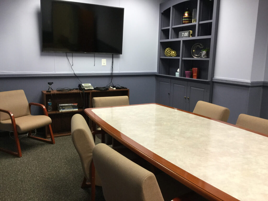
When managing editors at The Bucks County Courier Times moved into the newsroom, one of their offices was converted to a conference room. It has become a popular spot for meetings, collaborative editing and private calls. (Photo courtesy of Jacki Gray and Michael Hughes)
Share with your network
A matter of space
You also might be interested in:
New year, same old meetings. Meetings that don’t include the right people or that include too many people. Meetings that could have been an email. But what if it didn’t have to be that way? As we kick off 2026, API wants to help you reset and rethink key meetings in your news organization.
It’s been a busy year for us: we held three API Local News Summits, built out a comprehensive guide to partnering with influencers, encouraged experiments with grants and cohorts, and supported news organizations with our products.
Today, we’re undergoing a bold transformation — reimagining ourselves as a platform that fosters generational solidarity and serves bicultural audiences from Gen Z to Boomers.


