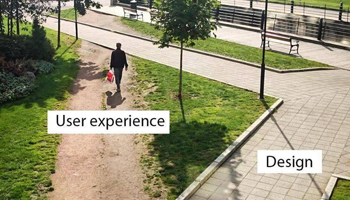
This ironic image is a classic reference in UI/UX design — the practice of designing for optimal digital user interfaces (UI) and user experiences (UX). Newsrooms have adopted these practices to better understand their audience’s digital behavior. Many of those principles can inform how physical spaces are designed in technology-driven workspaces.
User experience design is fundamentally practical in nature, focusing less on vision and more on problem-solving. One of the first steps before initiating a major remodeling effort is to identify the problems you’re trying to solve.
While managers and architects may have their own ideas about what needs to be fixed, all good design begins with understanding the user. Human-centered design is a useful framework that prioritizes user needs as the basis for any design process and expresses empathy for the people you’re designing for.
Listening to the user
Not every newsroom interviewed for this report used a design agency to survey staff and stakeholders, nor did they necessarily use formal “UX,” “human-centered,” or “design thinking” methodology. But user needs were at the forefront of their decisionmaking, and each gauged these needs in their own ways.
“We’re a newspaper,” said David Shribman of the Pittsburgh Post-Gazette, revealing his no-nonsense approach. “This was not a graduate school exercise in relationship between light and words typed per minute. We didn’t engage social scientists to determine ratios of empty space to creative thought.”
However, empathy for his colleagues was at the root of the company’s relocation and remodel, in which they opened up their new newsroom to allow for clean sight lines and plenty of light. “We just wanted a new place where our employees could be productive and happy,” he said.
The company couldn’t afford an expensive, involved planning process. He listened to his newsroom staff and worked closely with Adrian Norris, creative director at The Globe and Mail in Toronto, who had travelled extensively researching newsroom design.
“We ordered a chicken dinner, and we mapped it out on a piece of paper,” Shribman said. “And it works spectacularly.”
At Treasure Coast News, Managing Editor Adam Neal said a grassroots approach seeded a shift to digital, which was spurred by Gannett’s purchase of the company in 2016. He thought the staff would be apprehensive after the purchase, so he wanted to make sure they were behind any changes to the newsroom.
“Corporate said, ‘Here are some tools,’” Neal said, but beyond that, the redesign was led by a committee of non-managers. That created a sense of ownership among the primary users of the space. “It didn’t feel like another corporate or management initiative,” he said.
In addition to seeking input from staff, the committee and managers listened closely to their audience.
“Talking to our readers was essential,” Neal said. “We used market research, we used stats, analytics, we did newsroom surveys, all of that … but there is no substitution for sitting down with someone over coffee for an hour.”
The committee of reporters and photographers spent about six months cultivating ideas and listening to readers. But they still had jobs to do. To stay on track, the committee devoted an occasional full day to plan as a team. It’s always a challenge to step out of the daily workflow, Neal said, but it was necessary to focus on the redesign.
The Center for Investigative Reporting created a whole-staff committee to figure out what they wanted out of their 2016 relocation and remodel. Unfortunately the top item on their wish list — being close to public transportation — wasn’t possible. Due to expensive real estate in the Bay area, they ended up sacrificing that for a “collaboration-inspiring” space they could afford, said managing director Christa Scharfenberg.
“It is a little off the beaten path, but it was really cool [and] within our budget,” Scharfenberg said of the former pipe factory in Emeryville, a few miles southwest of their previous location in downtown Berkeley. This bright, dramatic space offered a blank canvas for creating the kind of cool space they wanted.
One of the center’s board members connected them with Ken Fulk, who recently made Elle Decor’s 2017 “A-list” issue.
“He donated his company’s time to create the design and layout for free,” Scharfenberg said. They were “very respectful of our limited resources.” She said newsrooms should cull their communities for creative talent to aid in their redesigns.
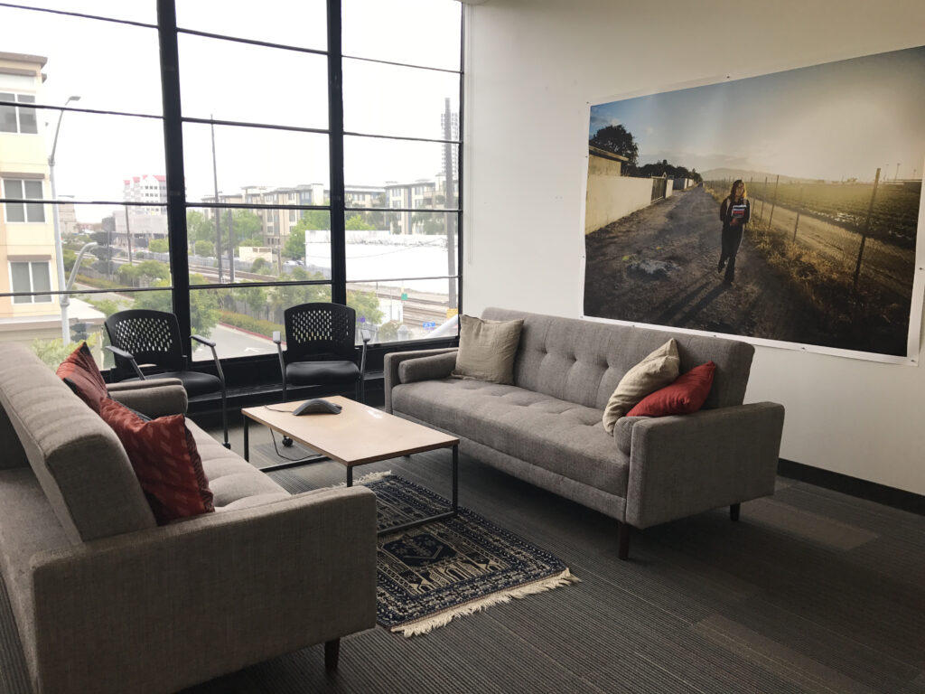
When the Center for Investigative Reporting moved into a former factory, the designer incorporated several lounge areas with “home-like” furnishings. These seating areas soften the industrial setting and provide alternative places to work throughout the day. (Photo by Rachel de Leon)
Don’t just listen to your users — observe them
For Zach Seward and his crew, nurturing culture is at the heart of Quartz’s success. So paying attention to user behavior — staff needs, personality quirks, personal interests and styles of experimentation — was essential to making their new space work. Impressed by what Desai Chia Architecture had done for the tech incubator Betaworks, Seward selected the firm to lead Quartz’s 2016 relocation and remodel.
Desai Chia started by surveying, observing and listening to staff over several days. The firm picked up a few themes and recognized beloved elements they should retain from the old space. The staff documented this process in a series of articles that share much of their thinking, from architectural layouts to musings on culture.
“We heard that there were a lot of coffee buffs, but that in the old office coffee was terrible, so they broke away and started making better coffee on their own,” Seward said. The informal coffee club, complete with its own channel on Slack, took to making specialty coffee in Chemex brewers, sometimes with beans from coworkers’ travels.
So Desai Chia was careful to incorporate a coffee-themed space in the new location.
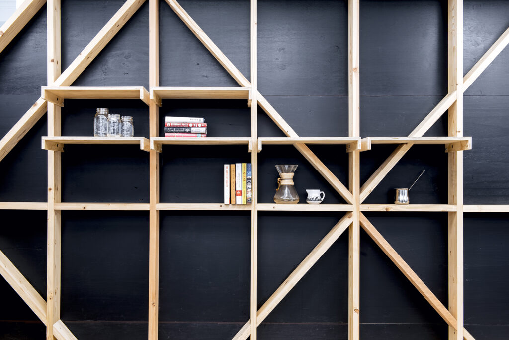
Quartz’s “Cafe” space celebrates a staff passion for coffee, and the Chemex brewing method in particular. (Photo by Mark Craemer)
“We also heard about a culture of tinkering,” Seward said. “Some staff had hacked the office in the previous space, added sensors to the dishwasher.” The new location has a workshop for staff to tinker away.
Three steps to learn what your staff needs and wants in their workplace
Real estate company JLL describes three issues to address when surveying employees prior to a relocation or remodel. Whether formally or informally, each newsroom in this study conducted some version of these analyses.
Location survey: This is about whether to renovate your current space or move to a new one. The answer depends on multiple issues: financial, real estate and behavioral. Suggested topics to survey:
-
Favorite/least favorite features of the building
-
Nearby activities and amenities
-
Commuting habits
-
Parking needs and issues
-
Use of amenities near the site, such as childcare, restaurants or walking trails
JLL recommends ranking responses and sorting them by age, length of employment and area of expertise. For example, a photographer will likely have different answers than someone in sales; you’ll want to keep these differences in mind as you review answers.
Workplace survey: This in-depth analysis focuses on how staff use the existing space. How well does it support — or inhibit — the work that needs to be done and how employees want to do it? Focusing on the nuts and bolts of day-to-day work, these surveys help to establish which spaces need flexibility, the ratio of open to closed spaces, traffic flow problems and other issues.
Many firms survey the entire staff and then interview representative members and key stakeholders. These surveys address a variety of factors that influence workspace design:
-
Practical needs: Questions like “What’s your average meeting size?” or “How much time do you spend working virtually with off-site team members?”
-
Culture and sentiment: “Do you believe your workspace reflects your company’s mission?” and “Does your workspace inspire you?”
-
Work habits and workflows: “What do you use Space A for?” and “How much time do you spend in Space B?”
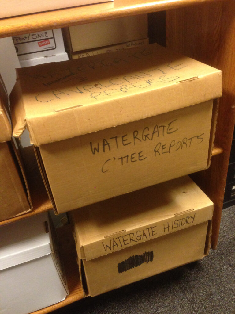
“It was the newsroom of Woodward and Bernstein,” Washington Post Deputy Managing Editor Tracy Grant said. But the company hadn’t really done anything to celebrate the legacy of the Post in its old space. This sort of issue can come to light by surveying your employees. The new newsroom, Grant said, “honors the tradition of The Washington Post.” (Photo by Garrett Rowland)
Baseline survey: This step is the most challenging because it is where you and your team do the hard work of figuring out what’s next and how to get there. This survey helps establish what you want the new space to achieve, such as spur more collaboration, support new workflows or offer more flexibility. The results will determine how your objectives fit into the current workspace, effectively illuminating what needs to change.
Questions are designed to highlight existing gaps and uncover solutions, such as:
-
“What inhibits collaboration in your current workspace?”
-
“How are you adapting your workspace for changes in workflow?”
-
“List all the potential activities you imagine doing in Space A, B, or C…”
-
“For each activity, indicate the number of people that would typically participate, how often and for what duration.”
-
“Are there any tasks you need to perform that you can’t in the existing space?”
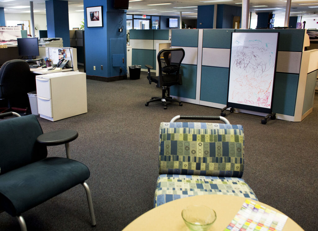
A bright paint scheme helped refresh the newsroom at the Virginian-Pilot and convey a fresh look for the newly digital newsroom. Updated, brightly-colored furniture in new seating areas provided new seating opportunities to meet and work away from desks. (Photo by The’ N. pham)
Share with your network
A matter of space
You also might be interested in:
New year, same old meetings. Meetings that don’t include the right people or that include too many people. Meetings that could have been an email. But what if it didn’t have to be that way? As we kick off 2026, API wants to help you reset and rethink key meetings in your news organization.
It’s been a busy year for us: we held three API Local News Summits, built out a comprehensive guide to partnering with influencers, encouraged experiments with grants and cohorts, and supported news organizations with our products.
Today, we’re undergoing a bold transformation — reimagining ourselves as a platform that fosters generational solidarity and serves bicultural audiences from Gen Z to Boomers.
