If you aren’t familiar with user-centered design, you can infer a lot just from the name. It is a process that puts the intended users of a product at the center of your decision making.
The potential strength of a niche app strategy is that it targets a particular defined audience. But here’s a problem: You are not your audience.
You don’t live their lives, you may not share their interests. So instead you have to listen as best you can and empathize. User-centered design is the key to understanding the audience so you can actually serve them well.
This is also sometimes called “design thinking” or “human-centered design,” but the ideas have much in common. The principles have been notably institutionalized and advanced into the business world by Tom and David Kelley of consulting firm IDEO, closely linked with the Institute of Design at Stanford University.
A note of caution: This is not about asking people what you should create. Deciding that question is still your job. User-centered design is about observing, understanding and empathizing with the needs and preferences of users, so you can figure out what problems you should solve for them.
This process will force publishers to look past their own business goals (which are still important, but the audience has to come first) or flashy software features that aren’t actually desirable.
Another point of emphasis: The “design” part of user-centered design is about much more than visual appearance. Design is the process of deciding what value the product creates and how it functions, not just what it looks like.
How it worked in Detroit
The Detroit Free Press used human-centered design processes in a lot of its strategic planning during the 2009 transition to three-day-a-week home delivery. It worked with IDEO on its overall communications and product development strategy, and the process became ingrained in the company.
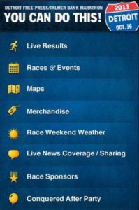
The lessons about how to derive insights from users were a great help in 2011 when the paper decided to create a special mobile app for its annual Detroit Free Press Marathon, which the paper owns and has been producing since the 1970s.
After each year’s race, the organizers survey runners for feedback and get thousands of responses, executive race director Rich Harshbarger said in an interview. When trying to design a marathon app, they went even further by bringing in runners for in-person research.
Because each runner registers his or her gender, age and hometown, the organizers could invite a diverse mix of runners. Runners were screened in advance and the final group of six or seven runners were offered gift cards to participate.
The runners had some homework to do in advance — organizers gave them several screenshots of a blank iPhone screen and invited them to draw their idea of a perfect marathon app, showing features and what it would look like.
Then the runners came in for about a 90-minute conversation.
“We set up a conference room where they would be seated at the front and then we would have 20-30 chairs for the audience. There was no separation, no two-way mirror or anything like that. It was just an open, moderated discussion,” Harshbarger said. “Some of the attendees would be folks from the business side, some reporters would be there, some editors would be there. It was all off the record, but it was just a way to understand their experience.”
The conversation helps the paper understand the other products runners use, like MapMyRun or RunKeeper. Participants talk about what they would pay for, or what they expect to be free.
The design thinking process
How do you do this? There are many possible tactics, but the most important common element say advocates of user-centered design is to observe and interview real users. Talk to people about the problems they face related to the topic you are studying. Observe and understand how they do things now, and look for pain points to relieve. Watch them use a prototype of your product and see if they navigate it successfully. Empathize, in any way you can.
It is best to approach this process in stages, so you don’t get ahead of yourself:
- Strategy: Understand the target audience, what is the market for your product and who are the competitors.
- Features: Based on the audience’s needs, decide what jobs the product needs to do for that audience. (Provide news, map locations, enable searches for data, etc.) These are the core software features of your product.
- User experience: How will the user navigate the app to find and use these features. Wireframes and storyboards help you specify basic organization, flow and layout.
- Visual design: Now is the point at which a one is finally ready to decide what all that should look like. Fonts, colors, design elements. Again, keep the focus on usability.
- Evaluation and iteration: Continue to test, learn and revise as you put early versions of the product in users’ hands.
These user-centered design practices can help shape many facets of news coverage and products, not just mobile ones. Digital First Media Project Thunderdome features editor Laura Cochran has drafted strategies for the company’s coverage of niche topics like technology, health, travel and entertainment by using a “persona” process.
The persona tool was pioneered by software designer and programmer Alan Cooper, whose consulting firm uses and teaches the principles widely today.
Personas are fictional characters who embody significant audience segments and behaviors identified through research. These archetypes are as real as possible — each has a name, gender, hometown, education level, occupation (including income bracket), a family status, and most importantly a defined goal or problem they want to solve and a defined motivation for doing so.
“Personas help you humanize,” Cochran explained. “One of the other big challenges people face in newsrooms is, when you are trying to talk to other people who are unfamiliar with what you do [the personas] are actually the characters in your narrative. So I can easily talk to someone on the sales side, I can talk to business development, I can talk to developers and say, ‘This is why I’m doing what I’m doing — because Julia is trying to do X and I need to help her do that.’”
These personas aren’t just an exercise in creative writing, however. They originate from research.
Cochran starts with as much quantitative audience and market data as possible from sources such as comScore.
Then she and colleagues will do in-person interviews with 12 to 14 diverse people who represent the extremes of beliefs and desires within the target audience.
For example, in the case of researching their technology audience they gathered people who were early adopters and those who saw little use for technology in their lives. They asked people questions about what the word “technology” means to them and the role technology plays in making their lives better.
They found many people cared more about household convenience like more advanced faucets and vacuum cleaners, or parenting issues like how to stop a teenager from texting while driving. This gave them a unique insight for moving their coverage beyond just new iPhones and drones.
“You want to get them to tell stories, you want to understand their lives and the challenges they have. You want to really understand why,” Cochran said. It helps to group interview subjects who know each other so they are comfortable talking and feed off each other.
Then the secondary market data and primary interviews get synthesized into a handful of personas that represent the major themes.
Finally, the team makes a strategic choice about which persona to target with its coverage or product. Now, with a clear target in mind, the product can be designed to meet the company’s needs and solve the users’ problems.
Share with your network
The best strategies for creating specialized mobile apps
You also might be interested in:
Case studies, like the ones in our 2025 impact report, are an opportunity to highlight those findings and spotlight some of the organizations that have partnered with API to collaborate, innovate and advance solutions for their communities.
As research continues to inform this slice of the news industry, we’ll continue learning, too. Who gets to be called a journalist in 2025 and beyond? What is the future of trustworthy information, especially considering the access to and trust for online content creators? How might journalism adapt to the rise, or co-opt the styles, of news influencers?
What if we started looking at our output as a product, not a service? Too often, we think "product" means a fancy app or a new website. But product isn’t about tech. It’s about intention.


