 Well-constructed offer pages are vital to the goal of increasing reader revenue. They can influence a user’s entire perception of your publication and service — for better or worse. Each detail deserves careful thought and planning. Yet just like registration pages, their importance is often overlooked.
When readers land on a subscription offer page, they are presenting publishers with a real opportunity. These users are weighing their options and deciding whether to pay.
Typically, they have clicked on links from social media, emails, your website or newsletters to reach this page.
The best subscription offer pages inspire trust. Language is clear and straightforward. Options address different customer needs. Clean layouts and user-friendly design make it a breeze for readers to find the product that is right for them and move on to registration and payment.
When creating an offer page, it is important to display each choice clearly. The calls to action must be clear and convey a sense of urgency. Most publishers and many e-commerce sites offer two to four types of subscriptions, with three being typical.
The following are examples of subscription pages that have used different tactics to keep customers on track to pay. These best practices come not only from the news industry but also from subscription software services, which face a similar challenge. In varied ways, these innovative pages have succeeded in their critical task — converting interested users into paying customers.
Emphasize the best offer
Publishers can use visual cues to highlight and distinguish different products and to support their goals for subscription and revenue. A “best offer” identifier is often a key element in subscription offer pages and a quick way to guide customers toward the choice that is right for them.
A simple callout: The Journal Sentinel
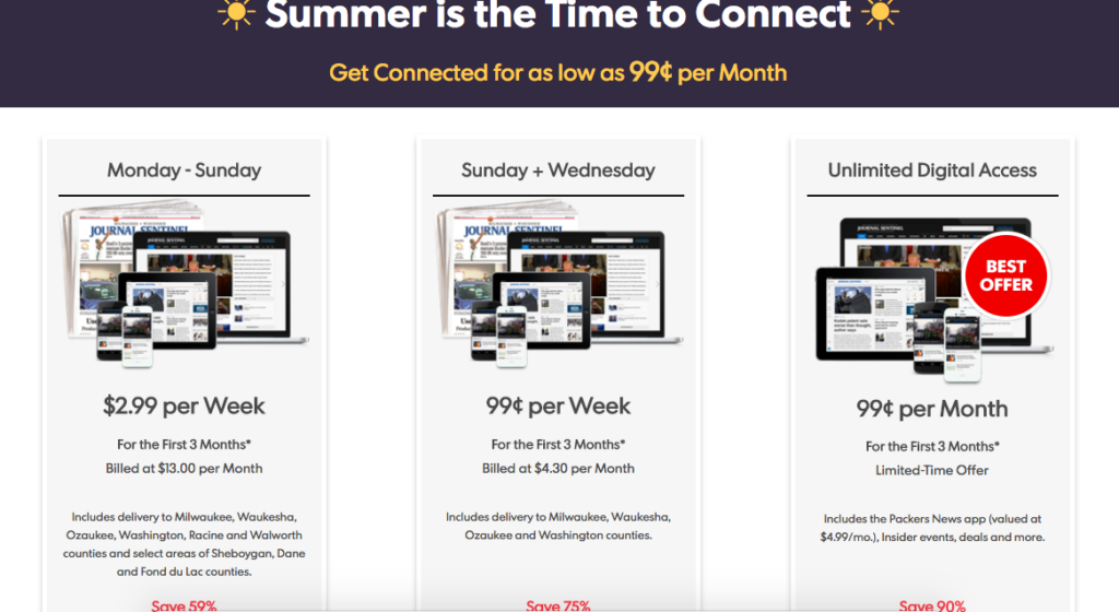
In this offer page by the Journal Sentinel, the “Best Offer” callout in bright red draws users to the cheapest option of 99 cents per month, which stands out from the other choices of $2.99 and 99 cents per week. (Also, it takes advantage of the fact that people read from left to right, by presenting the best off as the last one.)
Subscriptions on sale: The Seattle Times
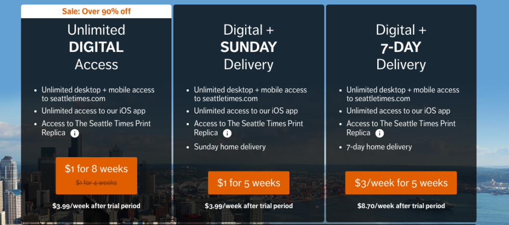
Consumers like to get a deal, and the Seattle Times responds to that urge with an attention-getting “Sale” sign over its best offer. The “Over 90% off” discount has a clear appeal to bargain hunters who are ready to subscribe.
Pitching digital for best value: The San Francisco Chronicle
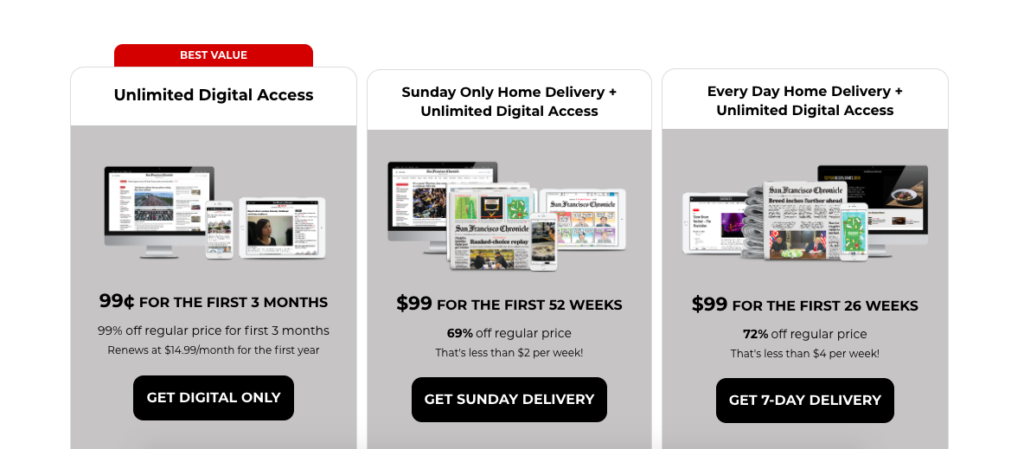
Well-crafted pages can appeal on multiple levels. In this page, the Chronicle plays up its value proposition in helping readers make informed voting decisions, while also steering them toward the best subscription value, which is for unlimited digital access. The repeated use of “99” in pricing options is both simple and catchy. But the red “Best Value” tag on the left makes clear which deal is the best.
Print plus digital equals extra value: The Economist
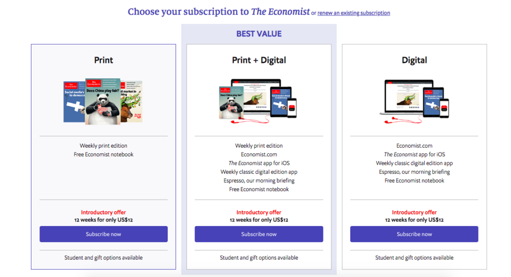
Best value does not always mean lowest price. In this example, the Economist encourages readers to select the print plus digital option by labeling it as “Best Value.” It charges the same $12 price for three different options — introductory subscriptions for print alone, digital alone or the recommended choice of print plus digital.
Comparative layout adds clarity to options
A feature comparison table can showcase different offers in a way that is simple for readers to absorb, while also communicating your value proposition. This matrix approach is popular for a reason: It works.
Options on the table: Baltimore Sun and Star Tribune
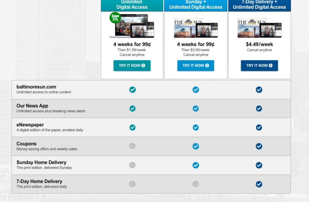
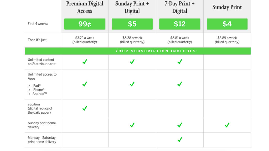
The following examples show the many details that can be conveyed through a comparison table, while keeping it easy for customers to understand their different choices. A matrix also enables publishers to highlight particular offers (frequently digital). For example, the Sun makes clear that it offers big savings for unlimited digital access. The Star Tribune takes a similar approach, offering “Premium Digital Access” at a much lower initial price than its other products. In both cases, users are able to make highly informed decisions about what they are paying for.
Guiding eyeballs by design: MarketingProfs
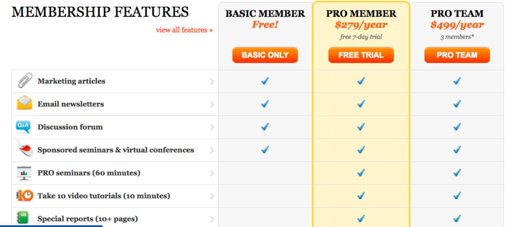
While a basic strength of the matrix approach is its simplicity, such comparison tables also can convey messages in subtle ways. This page by MarketingProfs, a B2B service for marketing professionals, guides the user toward the Pro Member option, by highlighting it with a different color, reinforcing its stature with a central display, and offering a free trial.
Consider innovative ways to engage users
Best practices for subscription offer pages apply not only to news organizations but to many subscription services, including software products. Some of these businesses are pioneering the use of interactive elements and aspirational appeals to win new customers.
Interactive tactics can spark sales: Form Stack
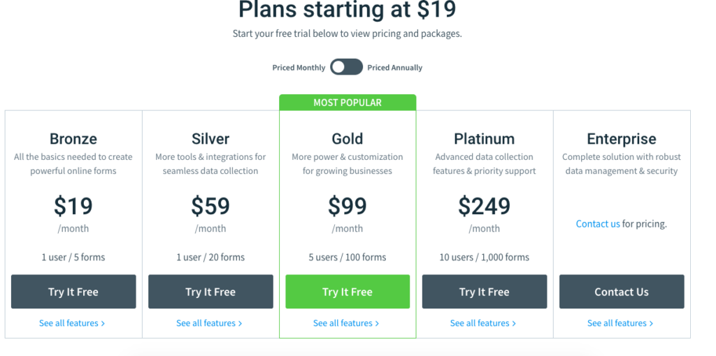
Digital offers lend themselves to interactivity, which can be a powerful way to engage potential customers. Form Stack, which offers form-building software online, lets consumers click on an interactive button to look at monthly or annual pricing (which also shows the per-month discounted rate). Of five choices below, it promotes its “Gold” option as “Most Popular” — appealing to those who trust the judgment of their peers and do not want to be left out.
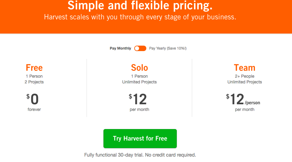
A team incentive: Harvest
To lure subscribers, this provider of time-tracking software has priced its “team” option the same as its “solo” option, even though more people get to use it. This strategy encourages purchases by project teams, which could be valuable customers. Further, team purchases may lead to higher retention, usage and reach.
A customized experience: DonorPerfect
Subscription pages can be (almost) as interactive as your imagination allows. DonorPerfect, which provides software to support donor management by nonprofits, has a slider bar on its subscription offer page which users can manipulate to find the package that fits their individual needs. This customized function lets interested customers learn not only how much they need to pay today but helps them plan for expansion in the future.
Additional resources
Marketing Experiments is part of the MECLABS Institute and offers a collection of optimization-related experiments and case studies. It also offers certification programs and training.
Hubspot provides marketing, CRM and sales solutions. Its blog covers various aspects of e-commerce, digital and email marketing, and sales processes and systems.
OptInMonster offers solutions to convert existing website traffic into leads. While they are mainly focused on e-commerce, there are still practices and tips that can be used in news and media organizations.
Pelcro is a content subscription platform that includes various paywall options. Its blog focuses on all aspects of building a content subscription site and offers practical advice on paywalls and digital subscription business models.
JeremySaid is run by marketing and conversion optimization consultant Jeremy Smith. On his site he shares free resources about conversion optimization and website psychology for in-house markers.
You might also be interested in:
Examples of how newsrooms have spun up live events, products and third spaces to experiment with new sources of revenue while fostering community belonging.
The American Press Institute has begun publishing takeaways from a new program to help local media collaborate with trusted messengers and influencers. In the coming weeks, we’ll share [...]
Interacting with your community and providing quality programming while providing the news may seem daunting, but it’s worth it.
