“We wanted more light and less vermin.”
Executive Editor David Shribman was blunt about why he needed to move his staff out of the historic offices of the Pittsburgh Post-Gazette, where journalism had been practiced since 1927.
For some newsrooms, relocation or new construction offers the best solution to several types of problems, whether it’s dealing with a newsroom emptied from rounds of layoffs, making room for future growth, or creating a workspace tailored for new digital practice. For the Post-Gazette, it was a way to walk away from the past and not look back.
“We had the worst newsroom in history — old building, no windows, divided up into little warrens because of weight-bearing walls,” Shribman said. “It wasn’t conducive to anything. Ugly, dirty, depressing.”
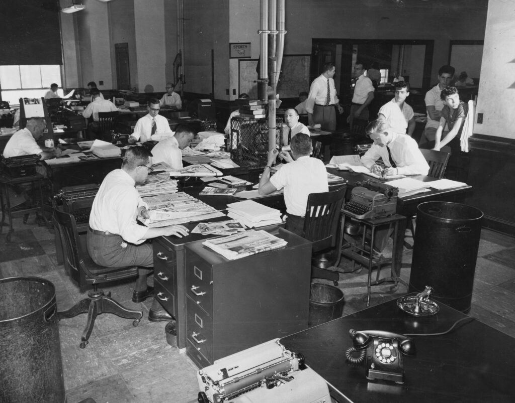
A glimpse back in time: The Pittsburgh Post-Gazette’s historic newsroom as it appeared in 1957, when it housed the Pittsburgh Press. (Photo courtesy of the Pittsburgh-Post-Gazette)
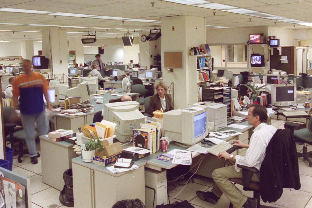
The Pittsburgh Post-Gazette newsroom around 2001. (Photo by J. Monroe Butler II)
Moving also made economic sense. Besides needing to replace the paper’s “antediluvian presses,” Shribman recognized the value of the real estate on the banks of the Allegheny River in downtown Pittsburgh.
“We were sitting on the best piece of land in Pittsburgh,” he said, “and we felt we could make some money by selling it.”
Robyn Tomlin, managing editor of The Dallas Morning News, had a similar opportunity. The company could invest in the newsroom’s future by moving from a historic building in a prime downtown location — and letting go of nearly $1 million in annual maintenance expenses.

The Dallas Morning News staff gathered for a group photo in front of the famous “Rock of Truth” in April 2017 to mark the 175th anniversary of parent company A.H. Belo, named for the founder of The Dallas Morning News. (Photo by Evans Caglage)
“We have been in the same building since the 1940s, a wonderful downtown building with a lot of history tied to it,” Tomlin said. The building’s signature feature is a three-story-tall inscription chiseled into its stone facade, known as the “rock of truth.”
Like the Pittsburgh Post-Gazette, the News needed to distance itself psychologically from the past and its “crazy little hovels and hallways” as it transitions to a new way of practicing journalism.
Staff are preparing for their move-in this fall, while the new space is being renovated. In the current building, “it feels like you’re walking into the 1940s when you walk in here,” Tomlin said. Although the inscription on the building still reflected the important work going on inside — “Build the news upon the rock of truth and righteousness” — the rest of the building did not.

Dallas Morning News reporters (clockwise from bottom left) Cary Aspinwall, Sarah Mervosh, Sue Ambrose and Terri Langford work in the current newsroom in conventional, but dated, cubicle spaces. (Photo by Irwin Thompson)
But a news organization need not move to innovate its space. For many, it makes sense to stay put and brighten the space, but also rearrange furniture and reorganize teams to reflect new ways of working. For the staff of Treasure Coast News, the building and location near downtown Stuart, Florida, were fine. They chose to refresh their newsroom design as they shifted to digital-first publishing.
Each of the media organizations interviewed for this study had its own, right-sized approach to renovating its newsroom — from small, DIY efforts that started with a can of fresh paint to elaborate architectural solutions that re-envisioned the newsroom from the ground up. Although the solutions varied in scope, several themes emerged as newsroom leaders detailed their shared quest to reboot physical space for digital practice.
Top reasons to renovate or move a newsroom
Make room to grow
“We had a vision of having our newsroom on one floor,” Washington Post Deputy Managing Editor Tracy Grant said of Editor Marty Baron’s goal to unify the newsroom.
But no building in Washington, D.C., offered a footprint large enough for the Post’s robust, growing staff to reside on one floor. They saw an opportunity at 1 Franklin Square, nicknamed the “Batman building” because of its two towers like Batman’s ears.
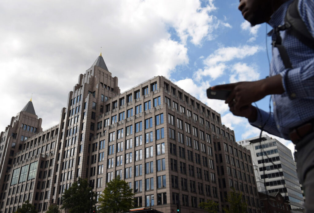
The Washington Post’s new home at 1 Franklin Square is only three blocks from its previous location. A key factor in choosing this location was that it’s within walking distance of the White House. The two-floor newsroom spans 400 feet on the top two floors between the east and west towers. (Photo by Matt McClain for The Washington Post)
“We blew through the walls to connect the east and west towers,” said Grant, which coalesced 111,000 square feet of real estate across the seventh and eighth floors into a newsroom that spans three quarters of a block.
A centralized, two-story-tall editing “hub” is the nerve center of the newsroom. Open and vibrant, it’s an elegant design concession to the division of labor across two floors, offering easy passage and clear views from one floor to another. Moving the editing hub to the center of the newsroom connects teams and activities from across the organization and emphasizes the Post’s silo-busting and digital focus.
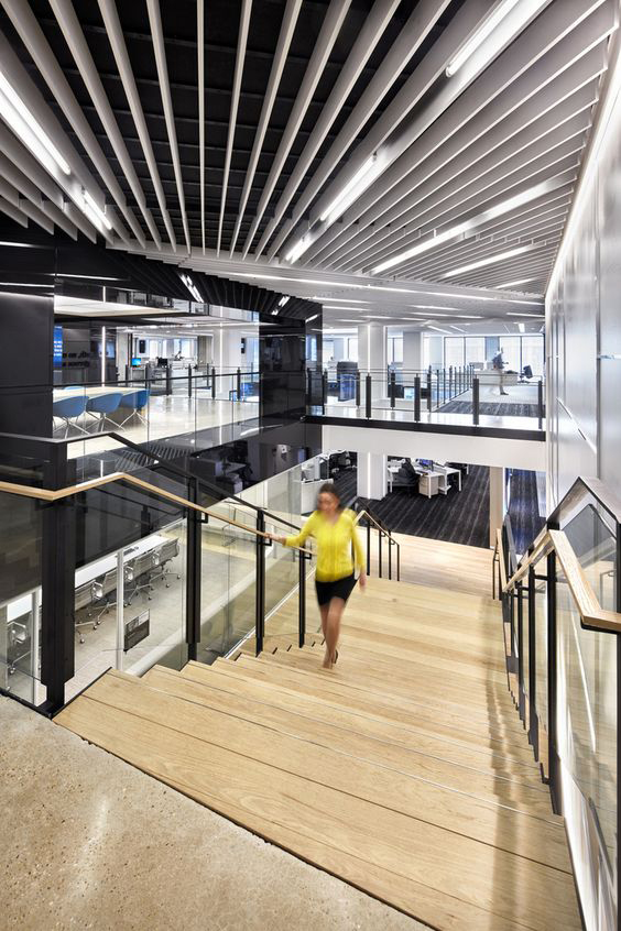
A news organization as large as The Washington Post can’t fit its entire editorial staff on one floor. To make it easier for staff to move between the two floors of the newsroom, architects incorporated stairs into the central design. (Photo by Garrett Rowland)
In contrast to the Post, Quartz was a startup within an older company, Atlantic Media. It had rapidly outgrown its open-floor newsroom and was ready to move to its third location in New York City in as many years. Its staff had grown from 36 in 2014 to 151 and counting. While some employees are in remote locations as part of a global team, the space needed for the staff in New York had tripled.
Zach Seward, executive editor and senior vice president of product, sought a space that would accommodate his growing team and maintain its open layout. He settled on the fourth floor of 675 Avenue of the Americas in the Flatiron District.
Seward was able to keep his team on one floor — for now. “I rue the day when we will have to be on more than one,” he said.
Reduce footprint after consolidation
At The Virginian-Pilot the need was contraction, not growth.
In 2016, “we closed our bureaus and decided to be one happy family,” said Rachel Jones, news operations team leader for The Virginian-Pilot in Norfolk. Jones reorganized the newsroom with a digital-first focus. Some administrative positions were cut to make room for digital hires.
“We knew we had to change our way of thinking, our way of selling, how we handle everything we do as a company,” Jones said. That included revamping the newsroom.
“We were going to build new offices,” she said. “We couldn’t afford it.” Instead, she used imagination, creative layouts, new furniture and some bright colors to consolidate and inspire the newsroom.
Staff dropped from 300 to 100 when the company eliminated its bureaus. Even so, Jones said, part of the challenge became, “how are we going to put all of these folks in one place?”
The Dallas Morning News is condensing its 400,000 square-foot operation into a more efficient layout of 100,000 square feet that favors multipurpose, communal space over private offices. The newsroom is now spread across three floors. The new one in another historic building will be on two floors, with an open layout and a mezzanine.
“We’re going from an organization that had a lot of offices to one that has three offices,” Tomlin said.
Without the need for so much square footage devoted to printing presses, a cable news network and all those offices, the new space will feature a more efficient digital newsroom with an integrated TV studio, one “built with intention instead of crammed into a corner.”
Bring in natural light
It’s no surprise that a window view improves employee satisfaction. But research by architectural firm RDG Planning & Design notes that even employees who did not have their own windows felt higher job satisfaction and perceived they were closer to windows when natural light diffused throughout the space.
As The Kansas City Star rethinks their newsroom design, “we want to make sure no one ‘owns’ the windows,” said Greg Branson, an assistant managing editor who leads presentation and innovation.
The Washington Post put a premium on natural light and found it to be one of the most satisfying features of its new location. The open layout and banks of windows allow sunlight to filter through glass-walled walkways into the newsroom’s central hub.
“Most people were gobsmacked by how light and bright everything was,” Grant said.
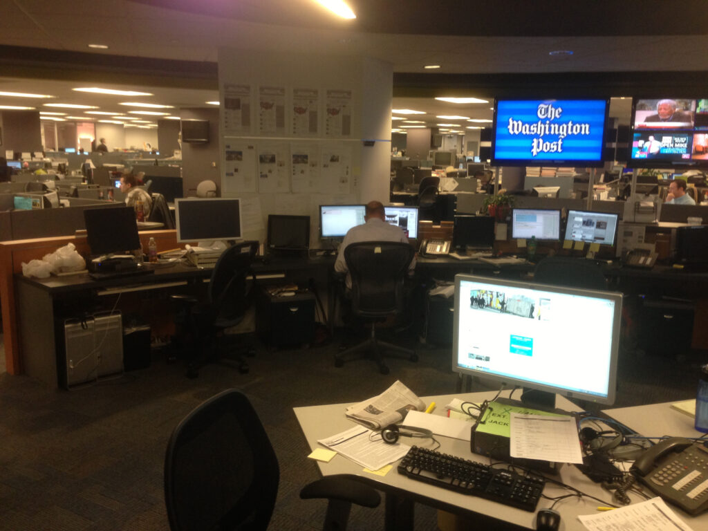
The Washington Post’s old newsroom had little light and was a labyrinth of desks that inhibited collaboration. Washington Post Deputy Managing Editor Tracy Grant said the new space was designed to facilitate quick communication and collaboration during breaking news — and to “get rid of anything that got in the way of good journalism.” (Photo by Garrett Rowland)
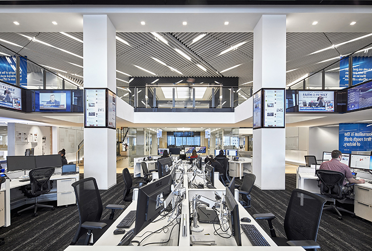
Spanning two stories, the central editing hub is the nerve center of The Washington Post. Designed for visibility and accessibility, the bright, open space capitalizes on natural light and enables clear views into the hub from glass-walled walkways on the upper floor. (Photo by Garrett Rowland)
Boost morale
Some news outlets saw that their employees, weighed down by rounds of buyouts, needed a different type of light.
“We’re a company in a financially distressed industry trying to find some oxygen,” said Shribman of the Pittsburgh Post-Gazette. For him, more light in a new, open space conveyed optimism and a way to face the future.
All editors interviewed for this study expressed concern for employee morale. They recognize the toll that economic uncertainty and continuing technological change have taken on employees. (This concern reflects the sort of empathy evangelized by proponents of human-centered design, discussed in “Engaging staff: User experience studies are not just for audience behavior.”)
Michael Hughes is senior manager of media design and production for Calkins Digital Solutions, which publishes the Bucks County Courier Times, Burlington County Times and The Intelligencer in Pennsylvania and was recently purchased by Gatehouse Media. For the company’s recent remodel at the Courier Times’ building, Hughes studied which paint schemes would create a welcoming environment.
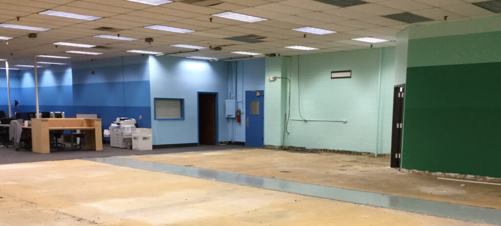
Michael Hughes, senior manager of media design and production for Calkins Digital Solutions, renovated the newsroom of the Bucks County Courier Times in stages. This photo, taken while the renovation was underway, shows the color scheme, which transitions from shades of blue to green. (Photo courtesy of Jacki Gray and Michael Hughes)
“If I’m going to do things that affect people’s lives, I wanted to be sure I was doing the right thing,” Hughes said. He chose shades of blue and green for the company’s production and newsroom spaces. The company also devoted a 25-foot wall to an inspirational message.
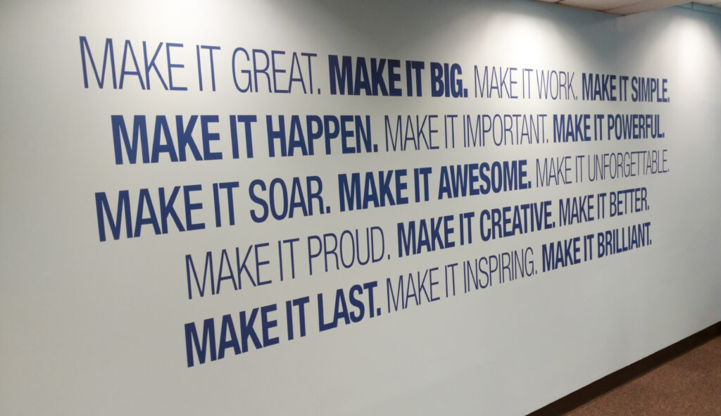
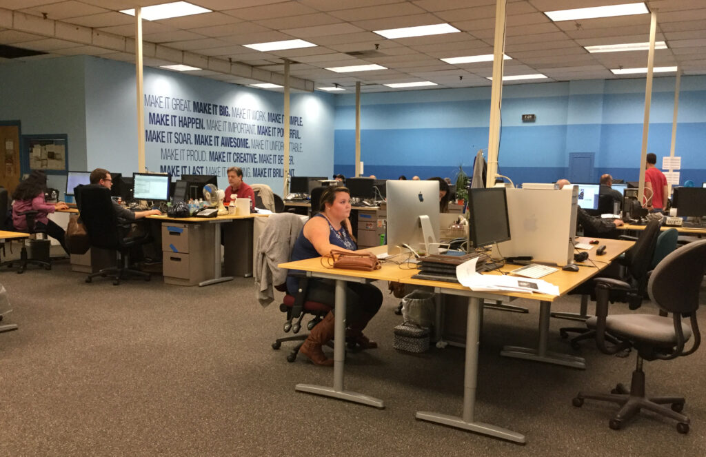
The inspirational wall decal and carefully selected wall colors help make the space welcoming and comfortable for staff. Wall decals like this are relatively inexpensive, easy to install and can be found on Etsy from a variety of vendors. (Photos courtesy of Jacki Gray and Michael Hughes)
Clean house
“The Life-Changing Magic of Tidying Up,” by Marie Kondo, perhaps best represents the current cult of minimalism sweeping homes — and offices — around the globe. At the heart of this philosophy is an almost spiritual letting-go of the past.
“The space in which we live should be for the person we are becoming now, not for the person we were in the past,” writes Kondo.
Substitute “newsroom” for “person,” and you have a mandate: Tidy up to make way for future ways of doing journalism.
“What an amazing metaphor for moving from print to digital,” said Jones, who guided The Virginian-Pilot through that transition. “Every single print record for which there was a digital copy was shredded.” In a budget-conscious quest for clean lines and minimalism, Jones decided at the outset, “We’re going to paint, and we’re going to declutter.”
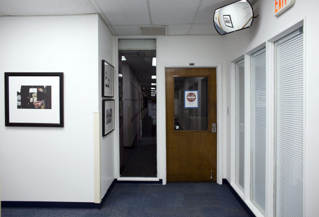
Rachel Jones, news operations leader for The Virginian-Pilot, aimed for a minimalist look when she oversaw its newsroom renovation. She chose a crisp, white color for portions of the new space. Something as simple as photographs throughout, mounted in black frames with gallery-style white matting, help create a unified look. (Photo by The’ N. pham)
Before the renovation, the editor’s office was walled in by cabinets. They were the first thing that had to go.
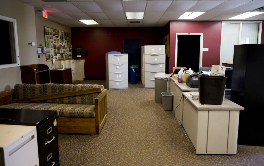
The Virginian-Pilot’s old photo department was marked by dated furniture, extra file cabinets and remnants of the old color scheme. This area was converted to a storage room as the photo team moved closer to the rest of the staff. (Photo by The’ N. pham)
“But it’s hard,” she conceded. “People don’t want to part with their stuff.” At first, Jones said, she started with an email about decluttering, but she soon realized she had to be more assertive.
“I brought in huge Dumpsters,” she said, “and people realized, ‘Oh, they’re serious.’” She set deadlines and told the staff everything that wasn’t sorted by a certain date would go into the bins.
Each employee at The Washington Post was given two orange crates. What didn’t fit had to be shredded, thrown away or taken home by moving day.
Staff at The Washington Post were guided through a year of decluttering. Posters were updated weekly to count down to moving day, suggesting “three things you can do this week” to prepare. “As the numbers got smaller, the urgency got higher,” said the Post’s Tracy Grant. People had to decide what to scan, shred, throw away or take home. (Photo by Garrett Rowland)
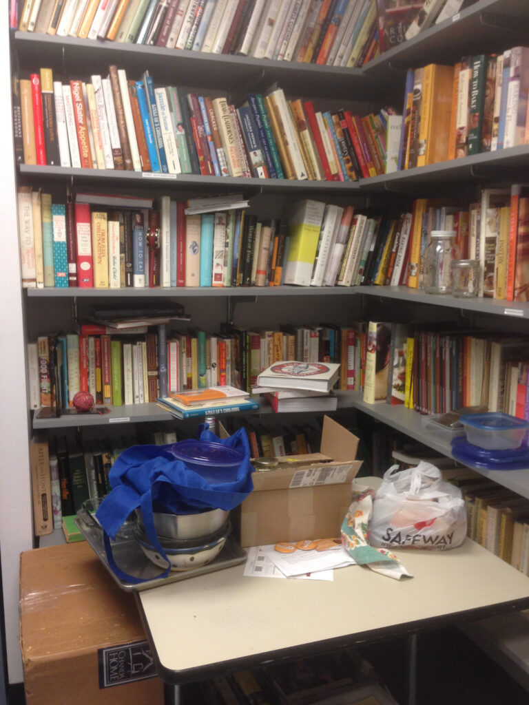
As a concession to the distress of letting go, The Virginian-Pilot allotted one storage room with a limited number of cabinets where people could store items they just couldn’t bring themselves to discard.
“Not one person has gone back and looked at their stuff in the storage room,” Jones said with a laugh.
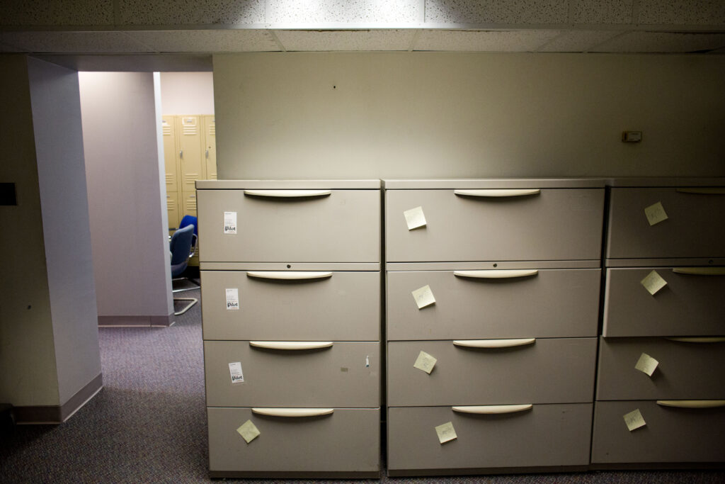
The final, clutter-free resting place for The Virginian-Pilot’s few remaining print files. (Photo by The’ N. pham)
Promote collaboration
At the Center for Investigative Reporting, “the model for our journalism is based on collaboration,” said Christa Scharfenberg, managing director and head of studio. “Half of our content is created by us; the other half is from newsrooms across the country, so communal space is key to getting the job done.”
The nonprofit’s new location, a repurposed pipe factory, has an open newsroom the size of a football field. That’s a stark contrast to its prior home in downtown Berkeley, where staff was scattered across three floors and “squirreled away in a little room in the basement.”
The new space better supports the organization’s collegial culture. “We have a communal kitchen space in the middle of our newsroom; we call it Cozy Town,” Scharfenberg said. Cozy Town serves as an all-purpose space to hang out, work in teams, and to for informal food and coffee clubs to meet.
Architects suggest these sorts of communal spaces can bring together people who don’t work on the same team, creating new connections and sparking informal collaborations.
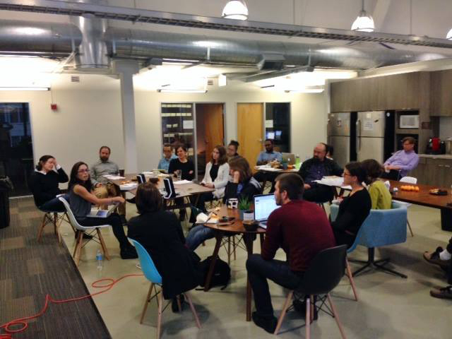
The Center for Investigative Reporting’s communal space, nicknamed “Cozy Town,” is used for social gatherings, food clubs, working lunches and breakout meetings. (Photo by Rachel de Leon)
Another simple feature encouraging collaboration is that the newsroom radiates around the hangout space and is organized into sections instead of long rows. Scharfenberg said this layout enables people to have quick conversations with other teams nearby.
That’s a benefit of the Post’s decision to organize its newsroom around the editing hub.
“In the old building, going to the hub was a tortuous process. Now moving between [floors] seven and eight is seamless,” Grant said. “Everyone has equal access … you can yell down to the hub.”
At Treasure Coast News, a simple change three years ago created communal space at the heart of the newsroom and signaled the organization’s goal to collaborate. Editorial meetings once held in a conference room now occur at a large table in the center of the open newsroom.
“No walls,” said Adam Neal, managing editor of Treasure Coast News and its website, TCPalm. “Now we hold all of our meetings right at that table, and if a reporter hears us talking about a story, they speak up and join in.”
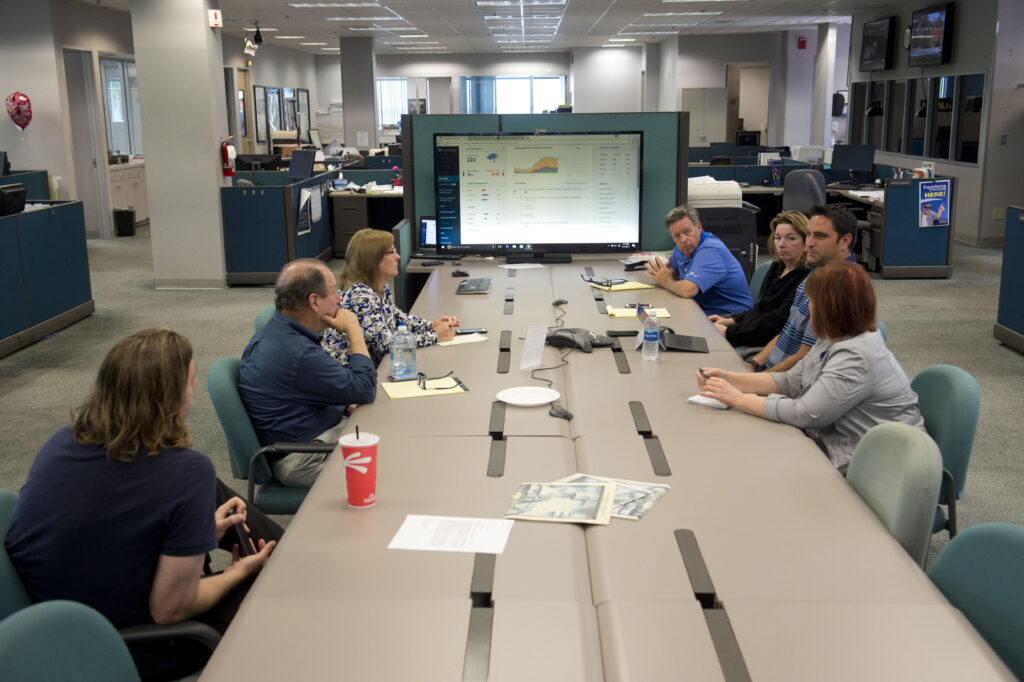
Moving editorial meetings out of a conference room and into the center of Treasure Coast News’ newsroom invites staff involvement when planning stories. “When we talk about a story in the middle of the newsroom, instead of a direct supervisor with a reporter, now you have a group of five to six people who can give feedback,” said Managing Editor Adam Neal. Staff have an open invitation to attend any meeting in this space. (Photo by Leah Voss)
Foster a culture of innovation
At Quartz, one of the goals was to represent the news organization’s culture of experimentation in a physical space — to create something “quartzy.” The newsroom’s display of this is more lo-fi than high-tech. Rather than wallpapering the newsroom with flashing screens, Quartz conveys its brand of innovation through human-centered space.
Modest wooden structures delineate creative spaces such as the workshop, which feels like a playroom for grownups and features a mix of maker tools and toys. A secret love of print manifests in a library featuring actual books. These areas express, without irony, the authentic culture of playful experimentation driving this young, digitally native publication.
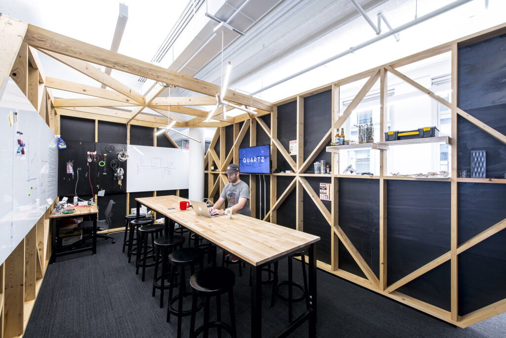
Resident tinkerer, coding coach and bot builder Sam Williams spends time in the Workshop, a space that reflects Quartz’s unique culture. Williams’ side projects — such as a sensor that indicates when the office dishwasher is done or the coffee bot that alerts staff via Slack when a fresh cup of coffee is ready — help Quartz explore applications for new technologies. (Photo by Mark Craemer)
To balance between solo and collaborative workspaces, every organization in this survey adopted its own version of “huddle” spaces. In the Center for Investigative Reporting’s sprawling newsroom, they took the form of closet-sized rooms.
At the Post, dozens of huddle spaces, designed for two to four people, are scattered throughout the newsroom. They’re decorated with historic newspaper headlines.
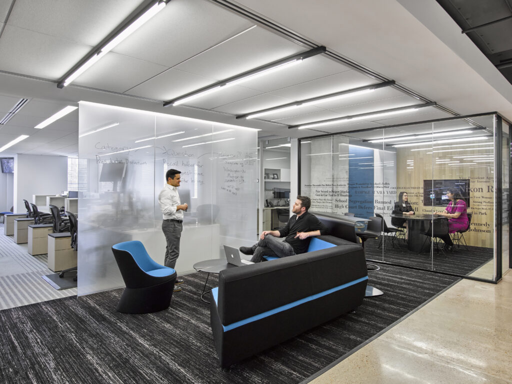
The Washington Post’s new space incorporates a number of small “huddle spaces” designed for impromptu collaboration. Less formal than a conference room, each huddle area has a unique aesthetic and creative furnishings to inspire innovative thinking. (Photo by Garrett Rowland)
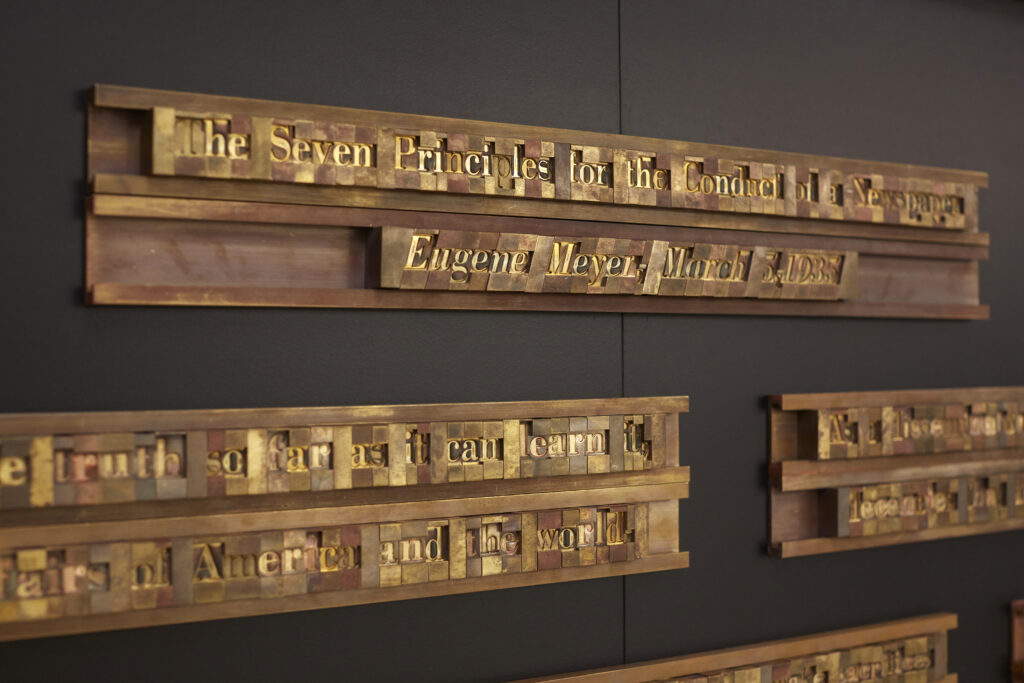
Elements of the Post’s history were artfully incorporated into the new decor. In 1935, publisher Eugene Myers put forth seven guiding principles for the conduct of journalism at the Post. Now the first thing you see when you step off the elevator on the seventh floor is this assemblage of metal type, evocative of a bygone era. “We had a discussion about updating the language, but decided to keep it as originally uttered,” said the Post’s Tracy Grant. (Photo by Garrett Rowland)
“There was a deliberate attempt to say, ‘Here is everything we are and will be in the next century, and here is everything we were before,’” Grant said.
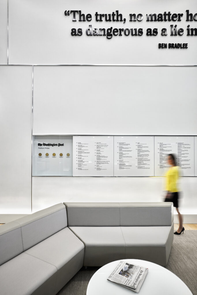
Diverse design elements celebrate The Washington Post’s history and achievements, such as this elegant display of its Pulitzer Prizes. (Photo by Garrett Rowland)
Share with your network
A matter of space
You also might be interested in:
New year, same old meetings. Meetings that don’t include the right people or that include too many people. Meetings that could have been an email. But what if it didn’t have to be that way? As we kick off 2026, API wants to help you reset and rethink key meetings in your news organization.
It’s been a busy year for us: we held three API Local News Summits, built out a comprehensive guide to partnering with influencers, encouraged experiments with grants and cohorts, and supported news organizations with our products.
Today, we’re undergoing a bold transformation — reimagining ourselves as a platform that fosters generational solidarity and serves bicultural audiences from Gen Z to Boomers.


