Explaining redistricting
Creator: The Asheville Citizen-Times
Summary: A Facebook video project on how redistricting affects North Carolina politics.
_____________________________________________
At the Asheville Citizen-Times a couple years ago, a group of journalists gathered in the lounge area in sight of displays tracking real-time audience metrics on the paper’s website. They could see that a critically important story about redistricting wasn’t doing so hot. Josh Awtry, then executive editor, and his team decided to try something that wasn’t often used in small newsrooms at the time — incorporating motion graphics into Facebook native video.
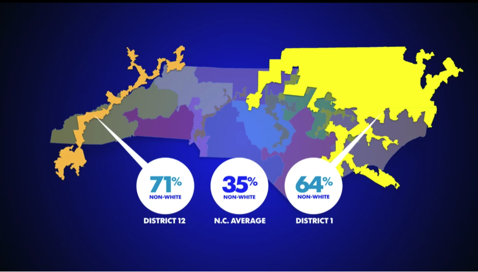
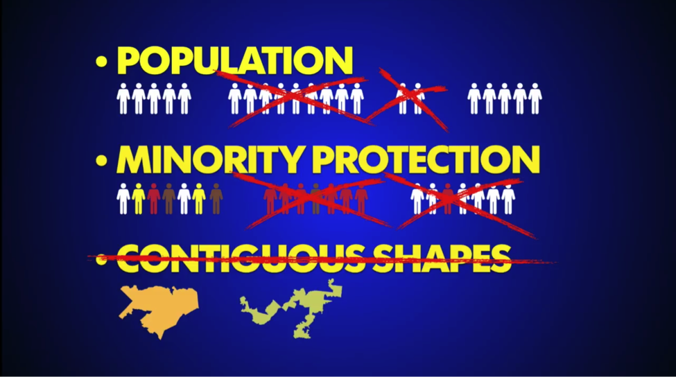
Awtry created a video using simple graphics, stock illustrations and an approachable voice-over to quickly explain recent redistricting in North Carolina ahead of election day.

“The hardest part is in ensuring you’re conversant enough in a topic to truly translate it conversationally,” says Awtry, who relied on Asheville’s government reporter Mark Barrett to help get him up to speed. “You need to understand the subject. … You can’t fake it.”
Instead of a traditional story with a declarative headline like “Redistricting to change Asheville’s landscape,” the video helps the reader understand the methodology that journalists used to reach that conclusion.
A headline like “How redrawing our political borders changes Asheville’s character,” says Awtry, “tells you you’re not going to get declarative facts, but rather the reasoning behind those facts.”
The experiment paid off with the Facebook video attracting more views than similar videos on the newspaper’s website.
“For us, this was the first example of the shape of things to come,” Awtry says. “To see a video reach its intended audience that much quicker and wider-spread was a powerful lesson. … It helps civically activate people who might otherwise gloss over this kind of ‘institutional but important’ topic.”
Now senior director for content strategy with Gannett, Awtry says audience metrics show the value of such content. “Sure, there’s the high-volume, fast-burning celebrity news and breaking stuff,” he says, “but right below that is a strata that should be our strongest franchise: helping people make sense of their communities.”
Awtry cites evidence showing that stories with “how” and “why” headlines do roughly 17 to 25 percent better than their counterparts. He’s encouraging Gannett journalists not just to recraft headlines to fit this mold but to think of stories and story forms that spur those types of headlines.
Awtry says readers are “hungry for explanatory work on topics they care about. If we can shift more of our time to that sort of work, we’ll be performing a huge public service.”
Technical notes and modifications: “People think you need a thousand dollar piece of editing software and certification to produce motion graphics,” but Awtry relied on “creative trickery” with Powerpoint, iMovie and a bit of Adobe Illustrator to pull it off using standard-issue tools. The audio was recorded hunched over a laptop speaker.
Gannett is developing a tool to better uncover what its member audiences are engaging with most, both in terms of page views and engagement time — and what they spend little or no time on — in hopes of redirecting journalists away from unnecessary work and toward more worthwhile projects.
Share with your network
Improving accountability reporting
You also might be interested in:
Local News Day highlights five ways these organizations matter within their communities. We’ve rounded up some of our favorite examples of this work in each category.
Case studies, like the ones in our 2025 impact report, are an opportunity to highlight those findings and spotlight some of the organizations that have partnered with API to collaborate, innovate and advance solutions for their communities.
As research continues to inform this slice of the news industry, we’ll continue learning, too. Who gets to be called a journalist in 2025 and beyond? What is the future of trustworthy information, especially considering the access to and trust for online content creators? How might journalism adapt to the rise, or co-opt the styles, of news influencers?


