The Lego Project
Creator: Tampa Bay Times
Summary: An interactive project built with LEGO pieces helps explain a confusing and controversial transportation plan.
_____________________________________________
Ultimately, it was the Lego game that helped Tampa residents and city leaders bridge the gap between a confusing, state-endorsed transportation plan and a clear understanding of its impact on residents.
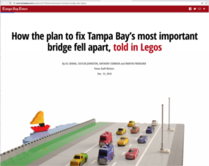
By piecing together the small, brightly colored plastic pieces to build a scale model of the heavily used Howard Frankland Bridge, adding stop-motion photography and just enough easy-to-digest text, a team at the Tampa Bay Times transformed a wordy proposal into something readers could actually grasp.
“How the plan to fix Tampa Bay’s most important bridge fell apart, told in Legos” — created by reporters Caitlin Johnston and Anthony Cormier, editor Adam Playford, designer Martin Frobisher, and designer and developer Eli Zhang — got its point across loud and clear. After the story was published, the bridge plan was shelved and sent back to the drawing board.
“Transportation concerns everyone, every day,” says Johnston, writing via email with input from Playford and Zhang. “Yet most transportation news comes across dry and jargony to a typical reader. The scope of the Tampa Bay Express project is large, and the level of details immense. Even though we narrowed the story to one part of the whole plan, it took a massive amount of reporting even for us to understand it all. It was our responsibility to simplify it and make it clear for our readers.”
Playford, the director of data and digital enterprise at the paper, came up with the idea to use Lego pieces — those whimsical toys that jog people’s sense of nostalgia — to explain the complications of the transportation proposal. He tapped into Zhang’s visual storytelling expertise to figure out how to make that happen. Zhang had gained insights into experimental storytelling as a graduate student. (Zhang wrote about the Lego project here.)

The story, which took about six months to create, was published as a standalone project online in December 2016. On the front page of the newspaper, a single image and an extended caption drove readers to the Web. Additionally, the story was promoted on social media platforms, accompanied by an interactive GIF of Lego vehicles moving along the bridge.
“We’ve received very positive feedback from our readers and wide applause in the journalism community” about the story, Zhang says. “It was the top story on our site for days. It even appeared in Spanish and German-language websites. … Several readers, activists and even politicians tell us that, for the first time, they finally understood the Department of Transportation’s plan for the bridge.”
“Explainers,” as they are called in the Tampa newsroom, have an edge over traditional story formats when it comes to increasing readers’ comprehension of sticky issues. “We focus our interactive journalism on stories with strong local watchdog reporting,” Playford says.
“The pairing of graphics and text enabled us to curate the experience with great precision – controlling what we want to appear in front of the readers first, what follows immediately, and what comes after a short pause,” Zhang says. “A traditional story form wouldn’t give us so much control.”
Now, more than ever, the team feels, the alternative approach to storytelling is essential and should be embraced as a way to connect with readers.
“Clearly explaining important topics…has always been a core part of our mission,” Playford says. “But the readership case for doing explainers has never been stronger, especially because they can do triple duty: in print today, online today, and online tomorrow and forever.”
Technical points and modifications: To create the model of the bridge, the team used a total of $186.39 worth of Lego pieces — and borrowed a few more from newsroom colleagues. Zhang made 336 “hand-crafted stop-motion frames” in the studio, which were then stitched together to create what he describes as a “stretched-out flipbook” of images he could choose from for the final product. Using the resources at www.buildwithchrome.com, a virtual world where you can build with Lego pieces, designer Martin Frobisher was able to better lay out the project’s timeline without resorting to more Lego purchases and extending the story’s deadline. “Most people didn’t understand that the plan called for multiple bridges built over several phases,” Johnston says. “This 3D tool allowed us to show the sequence of which bridges would be built (or torn down) and in what order. Some Photoshopping and smart labeling also helped clarify things, making the virtual Lego world an important part of the story.”
For newsrooms without the time or resources, Johnston recommends: “Think visually. It doesn’t have to be as grand or complex as a stop-motion, in-studio Lego replication. While our staff includes an amazingly talented graphics team, they’re usually in high demand and thus not always available. As a transportation reporter, I have to find ways to help my readers understand these complex projects. Maps help. I’ve slowly taught myself how to use Google Maps and Fusion Tables. Once my readers can visualize the project, it’s easier for me to then explain any controversy related to the plans.”
Share with your network
Improving accountability reporting
You also might be interested in:
The study’s findings likely align with news engagement behavior you’re already noticing, but the data across age groups shows these shifts cannot be written off as a passing trend that younger generations will age out of. Here are four key takeaways and what they mean for local news.
This report draws on a nationally representative survey of teens ages 13–17 and adults 18 and older, providing one of the most comprehensive, generationally comparative looks at how Americans navigate an increasingly complex news, information and media ecosystem.
Local News Day highlights five ways these organizations matter within their communities. We’ve rounded up some of our favorite examples of this work in each category.


