Tracking Trump
Creator: The Washington Post
Summary: A database/tracking tool helps keep tabs on changes made by the Trump administration. Charts and cards, rather than pages of writing and rhetoric, can distract from partisanship and instead focus on learning.
_____________________________________________
With a new president elected on a promise to overturn the work of the previous administration, The Washington Post needed a way to keep tabs on those promises, something that went beyond the typical drip-drip-drip of regulation reversal stories.
White House reporter Juliet Eilperin, who covered the Obama administration and the creation of rules that President Trump was dismantling, worked to document changes by the new administration. She and her editors talked out the findings with the Post’s graphics department — including graphics editor Darla Cameron — in hopes of developing a tracking tool for the information.
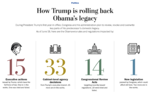
The resulting project covers a range of ways the Trump team can change Obama policy — via executive actions, Cabinet-level decisions, Congressional Review Acts and legislation. (Cameron was assigned to the project after her work on a similar tool that charted the scope of President Obama’s executive actions to give readers a sense of what it might take to overturn them.)
Cameron notes that such explainers don’t take the place of a traditional narrative; a “daily story” is typically still written about each regulation change as it happens. The database simply offers readers an umbrella tool to understand all the changes the administration is trying to make, where each effort is at in the process and which ones have succeeded so far — all in an accessible, navigable way.
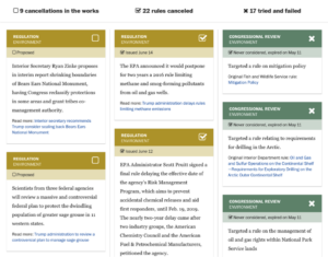
Readers can sort the database of Trump-era changes by topics such as environment, civil rights and health care. The results offer a running tally of which Obama regulations the Trump camp is targeting and what their status is. Each change or proposed change is presented as a summary card, often with links to a more descriptive story that readers can go to for more context.
The Post plans to maintain the database tool for the first year of the Trump administration.
The device has a lot of longevity and exposure with links promoting it from related stories on any Trump administration change. Cameron pointed to a slate of similar tools The Post has built to keep tabs on the new White House:
- Tracking how many key positions Trump has filled so far
- Here’s what we know so far about Team Trump’s ties to Russian interests
- In 137 days, President Trump has made 623 false and misleading claims
“This tracker format is a useful way for us to follow the rapid changes taking place in Washington,” Cameron said.
Technical notes and modifications: The Post’s team set a watch list on the legislative tracking tool Fiscal Note to follow bills as they made their way through Congress. Other changes, such as cabinet-level agency decisions, are predominantly tracked through reporting, so the team keeps in touch with reporters covering each federal agency. When something new happens, information is added to a Google spreadsheet and a script is run to re-generate the data and publish the updated graphic. Cameron said the database uses open-source tools created by the New York Times to streamline the publication process: ai2html and Archie Markup Language.
Cameron cautions that smaller newsrooms shouldn’t feel an urgency to unearth the perfect interactive tool or create a one-size-fits-all approach for future graphics. “It starts with conversations between designers, reporters and editors about what a story really needs to be effective,” she said. “From there, teams can slowly build up an environment where they can create more customized content.” She recommended this NPR blog post explaining the visual creation process. “It’s important to remember that no single explainer format will work for every story, and not everything can, or should, be made into a reusable tool. It’s more important to build a system that allows for creativity in storytelling.”
Share with your network
Improving accountability reporting
You also might be interested in:
Case studies, like the ones in our 2025 impact report, are an opportunity to highlight those findings and spotlight some of the organizations that have partnered with API to collaborate, innovate and advance solutions for their communities.
As research continues to inform this slice of the news industry, we’ll continue learning, too. Who gets to be called a journalist in 2025 and beyond? What is the future of trustworthy information, especially considering the access to and trust for online content creators? How might journalism adapt to the rise, or co-opt the styles, of news influencers?
What if we started looking at our output as a product, not a service? Too often, we think "product" means a fancy app or a new website. But product isn’t about tech. It’s about intention.


